Tooniverse Renewal
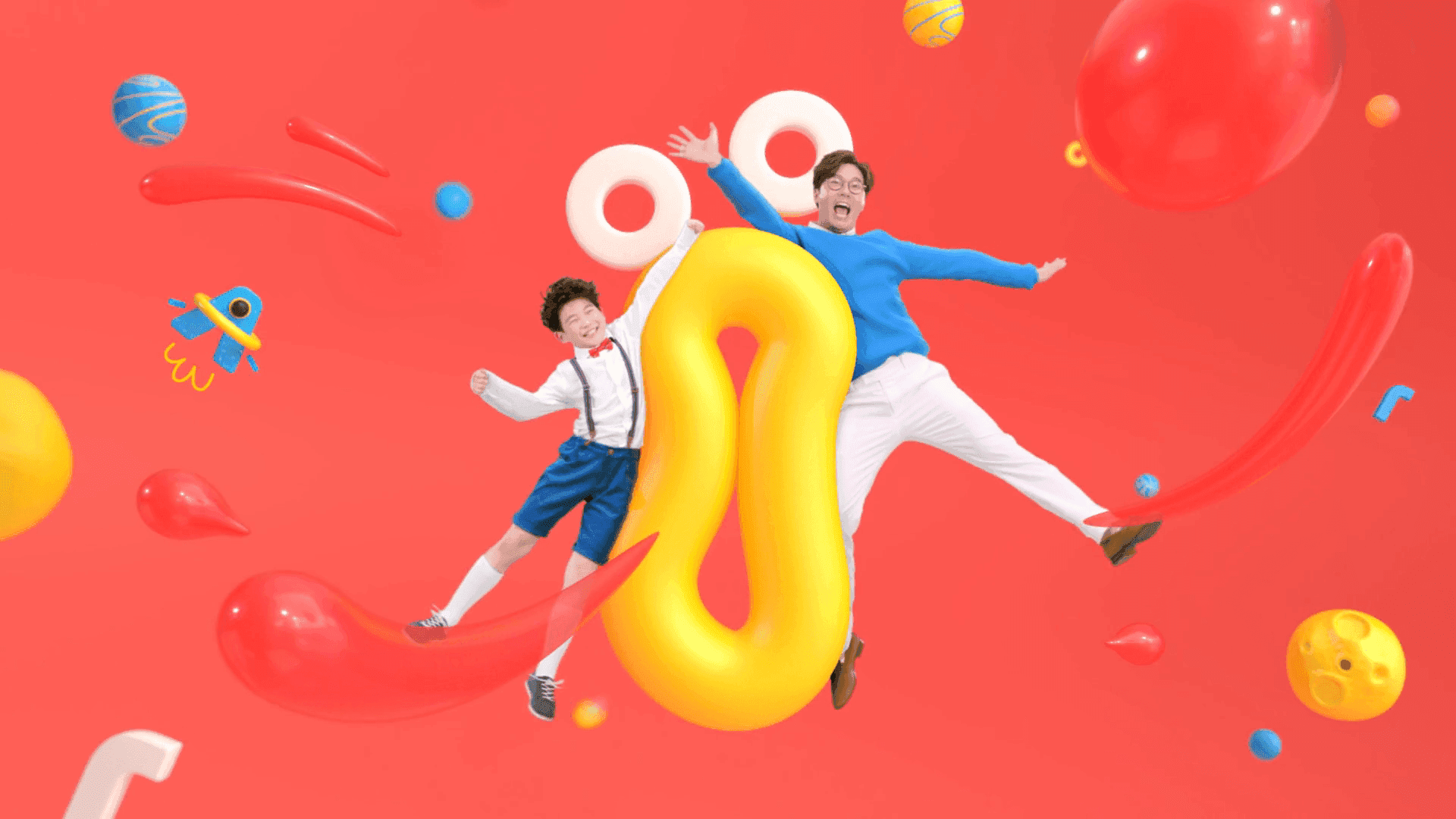
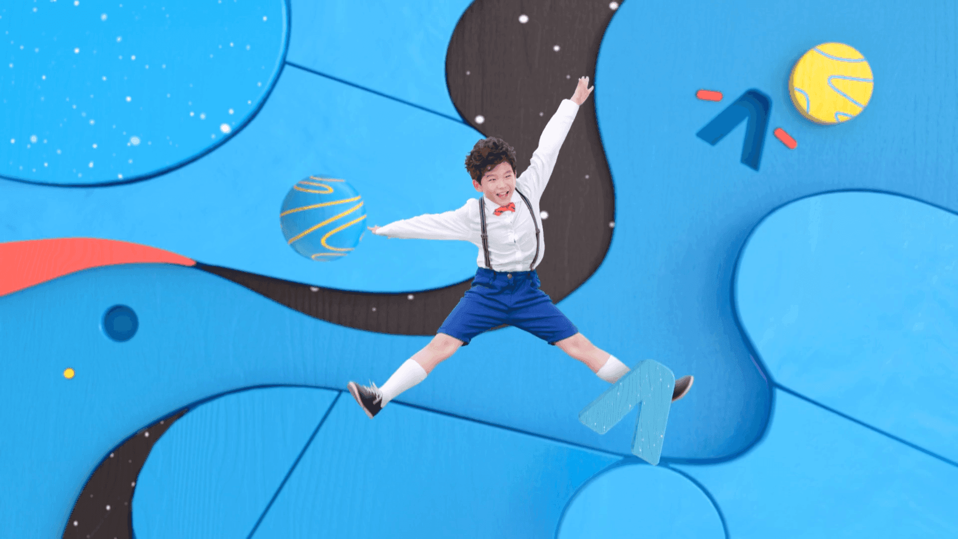
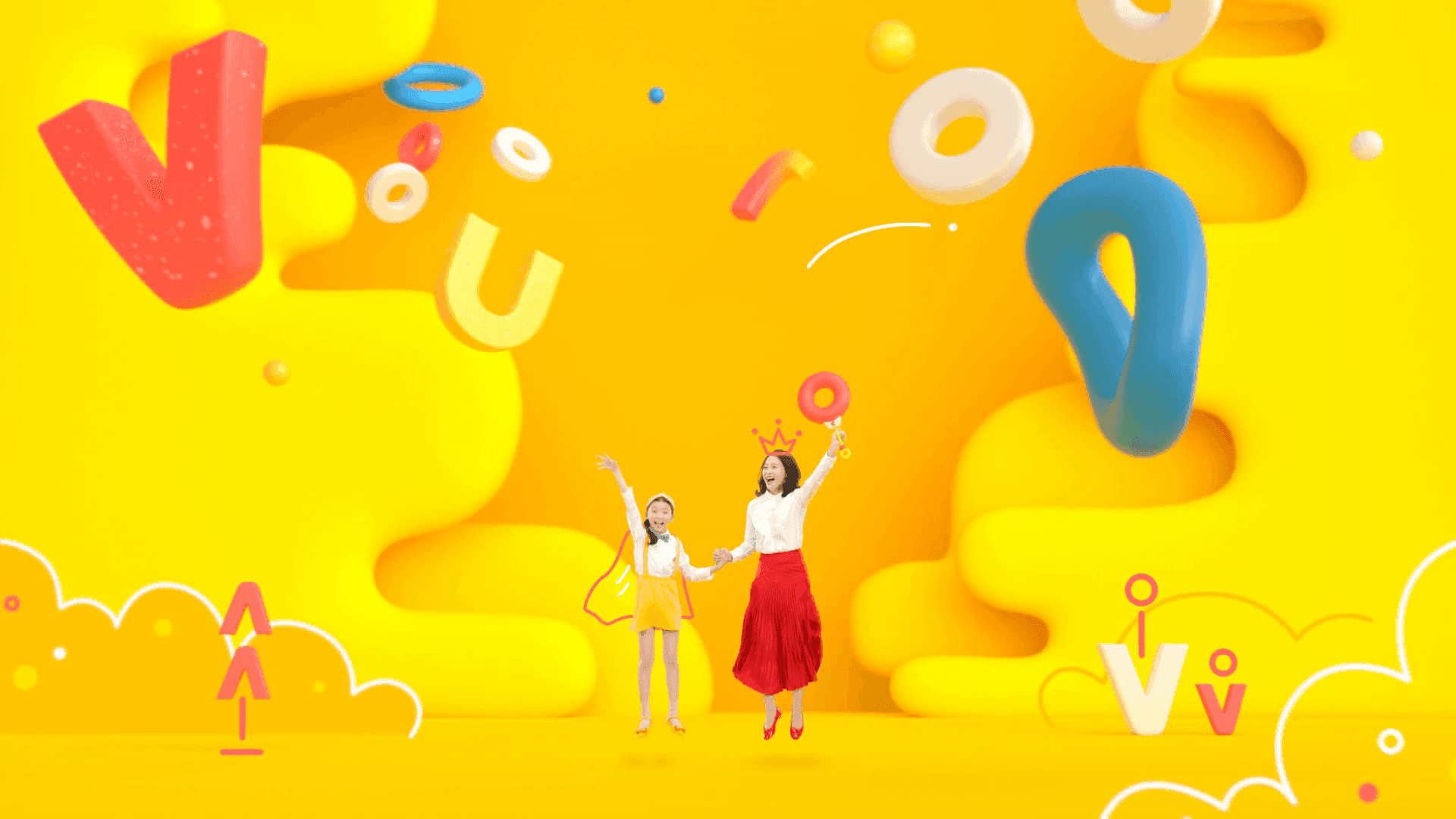
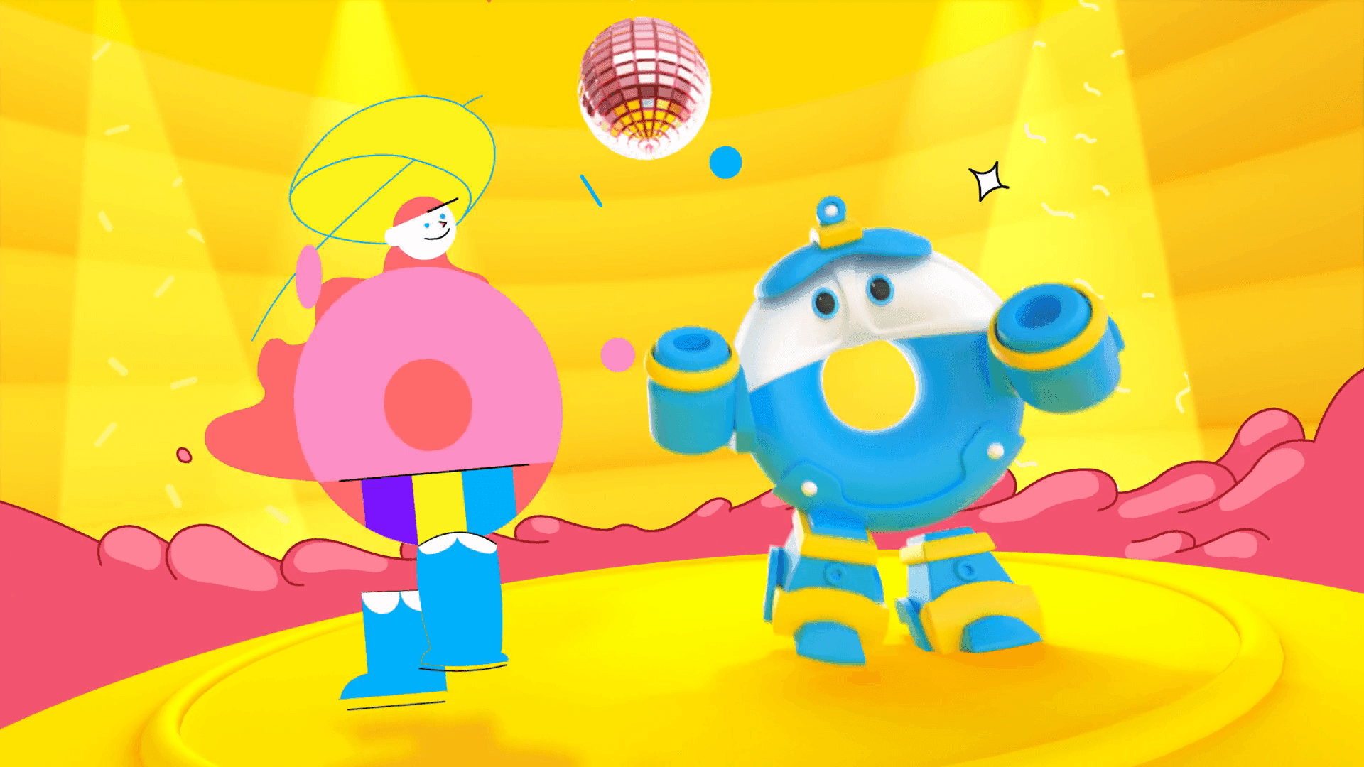
A brand rebranding project that expanded TOONIVERSE beyond its traditional focus on children to become a channel enjoyed by both children and their parents. The brand was redefined around shared content and experiences across generations, with a renewed visual identity spanning color, logo, and slogan. 기존 어린이 중심의 TOONIVERSE에서 벗어나, 어린이와 부모 세대까지 함께 즐길 수 있는 채널로 브랜드의 타깃과 이미지를 확장한 리브랜딩 프로젝트입니다. 세대가 함께 공유할 수 있는 콘텐츠와 경험을 중심으로 브랜드의 역할을 재정의하고, 컬러와 로고, 슬로건을 포함한 전반적인 비주얼 아이덴티티를 새롭게 구축했습니다.
- Role & Scope
- Brand Repositioning / Visual Identity / Broadcast Graphics
- Category
- Channel Branding
- Year
- 2020
TOONIVERSE had long been recognized primarily as a children’s animation channel. As a generation that grew up with TOONIVERSE became parents themselves, there was an opportunity to evolve the brand into a channel where children and parents could enjoy content and share experiences together.The goal was to broaden the audience beyond children and create a more inclusive brand that could connect with both generations. 기존 TOONIVERSE는 어린이를 위한 애니메이션 채널이라는 이미지가 강했습니다. 하지만 어린 시절 TOONIVERSE와 함께 성장한 세대가 부모가 되면서, 아이와 부모가 함께 콘텐츠를 즐기고 추억을 공유할 수 있는 채널로의 확장이 필요했습니다.이에 타깃을 어린이에 한정하지 않고 부모 세대까지 아우르며, 세대가 함께 공감하고 즐길 수 있는 브랜드 이미지를 구축하고자 했습니다.
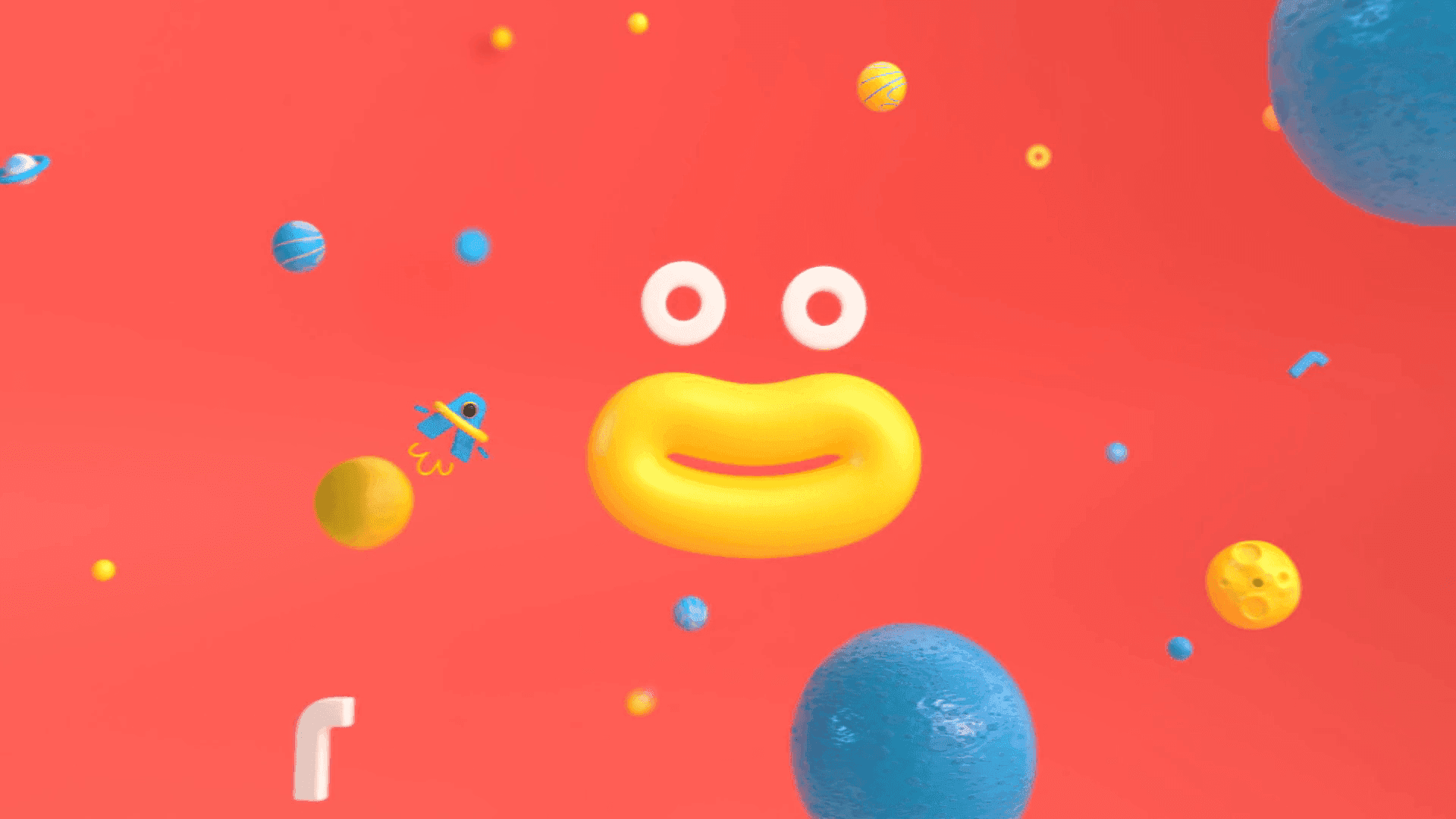
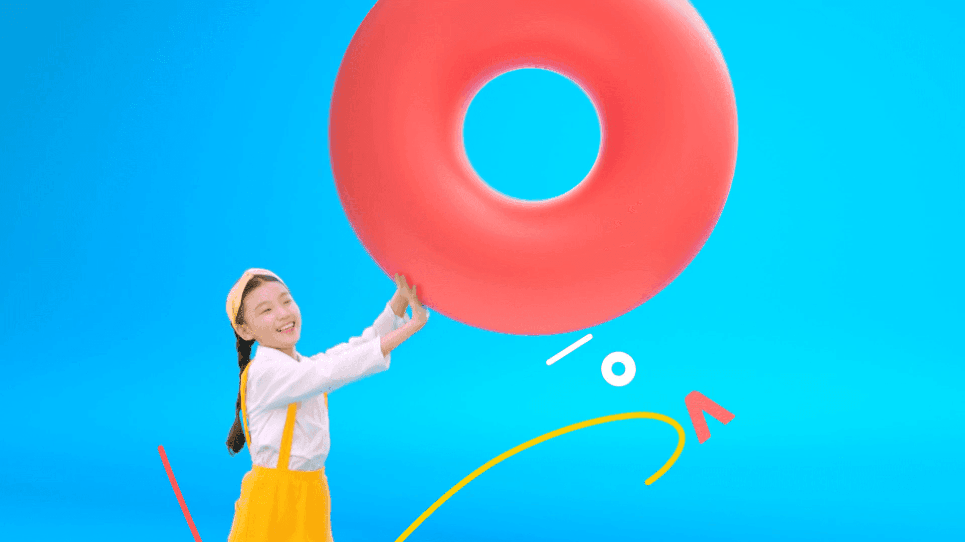
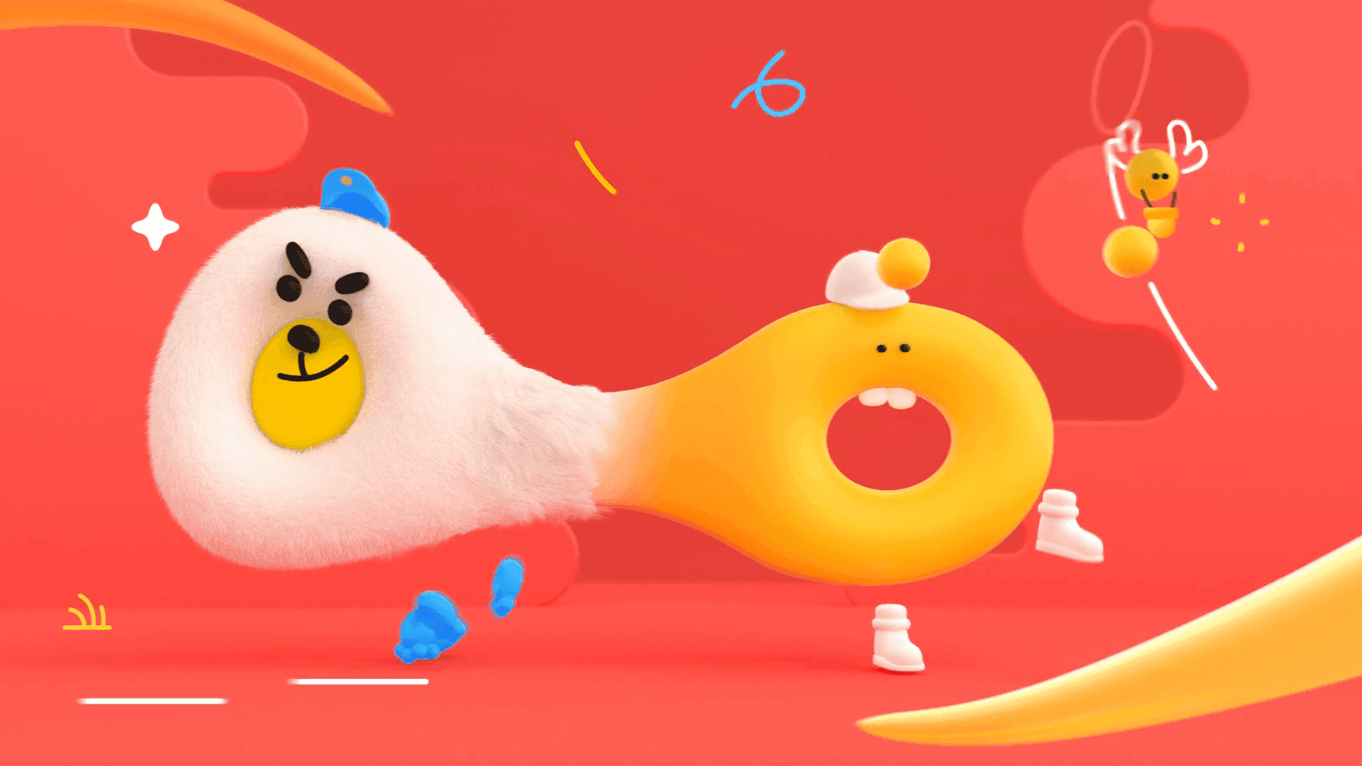
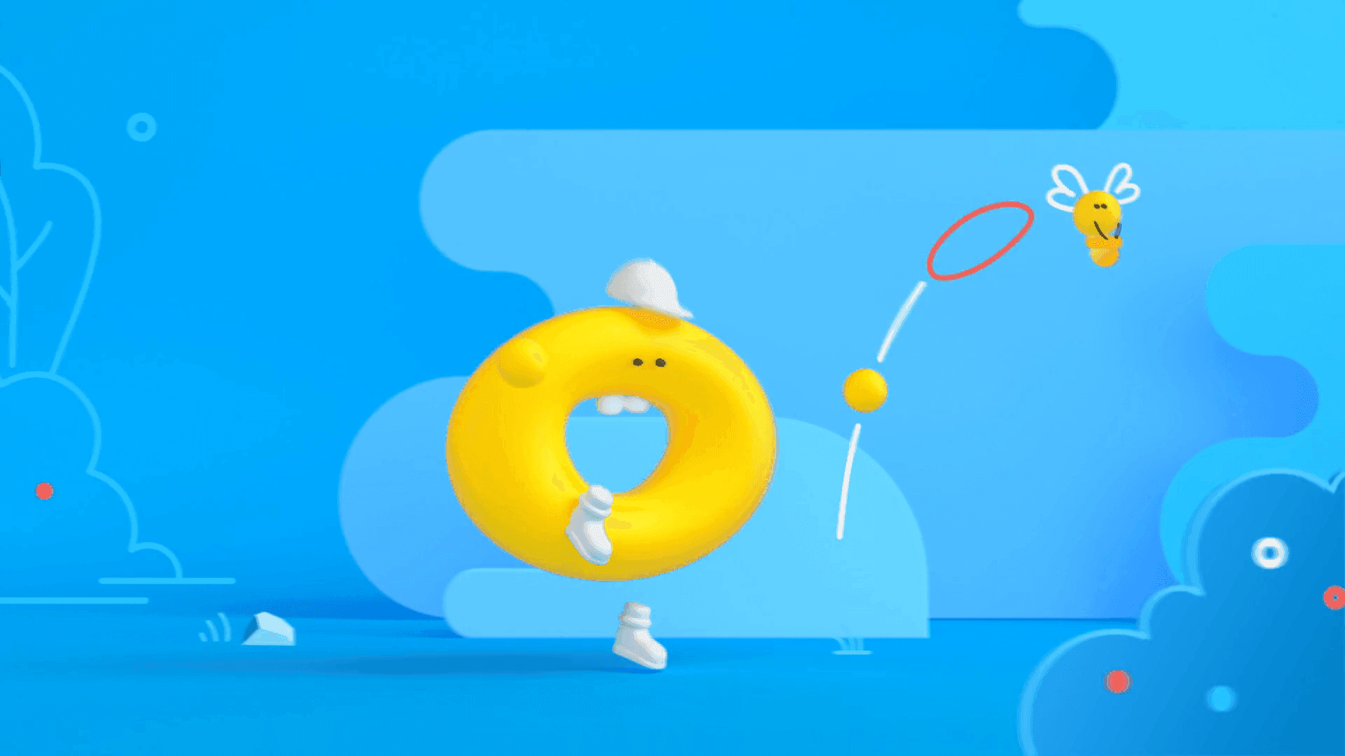
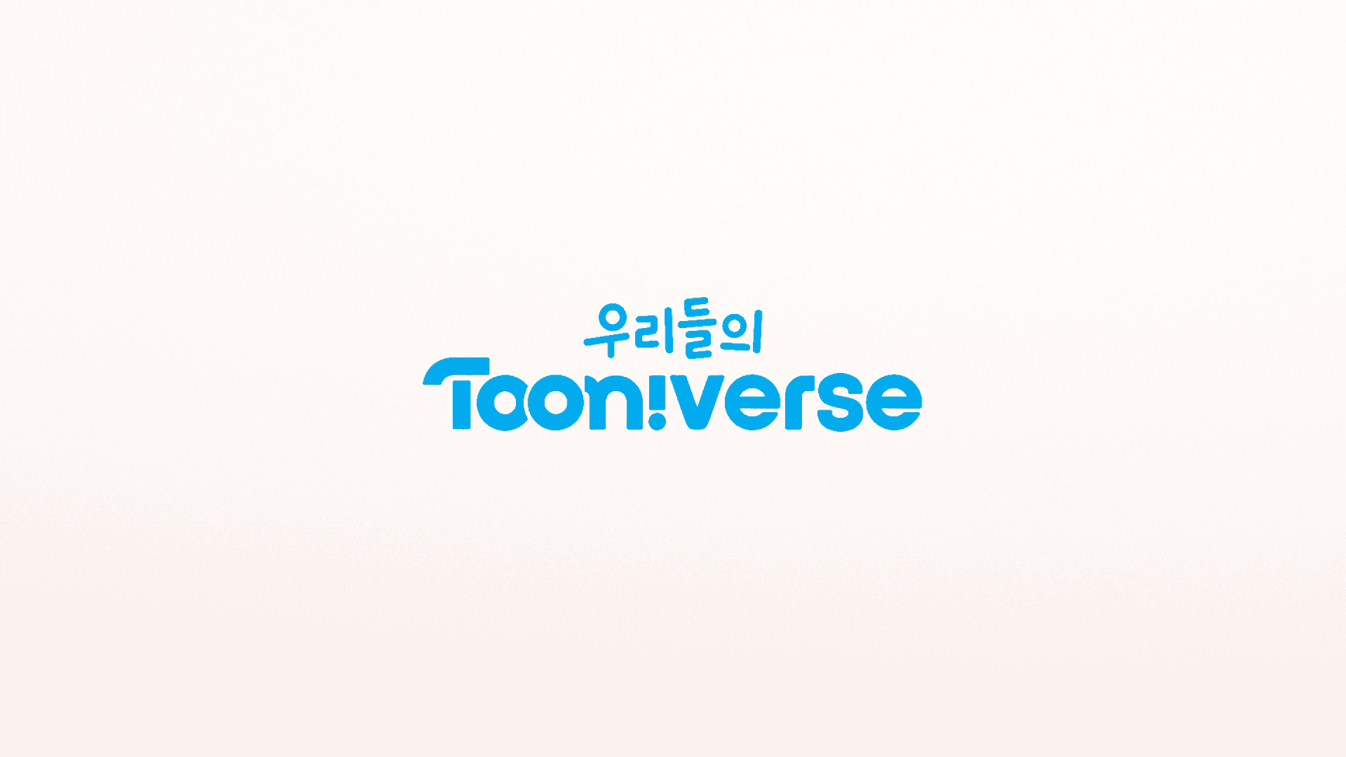
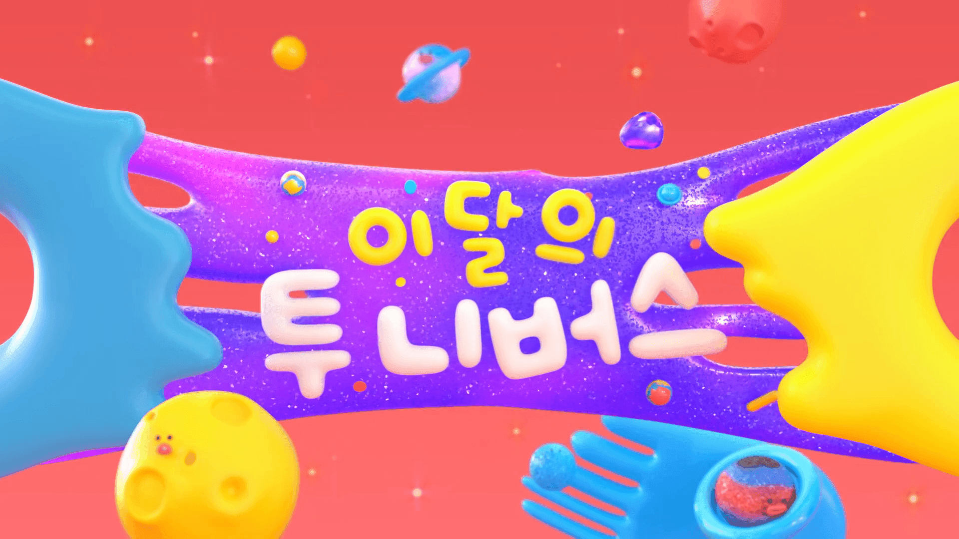
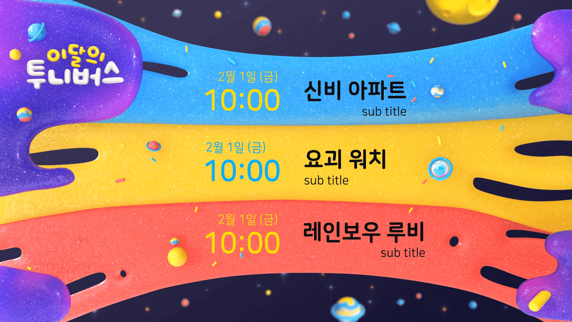
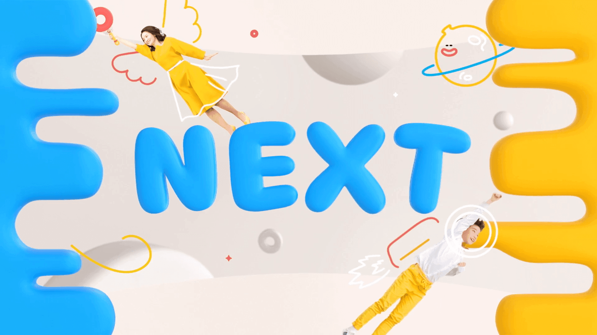
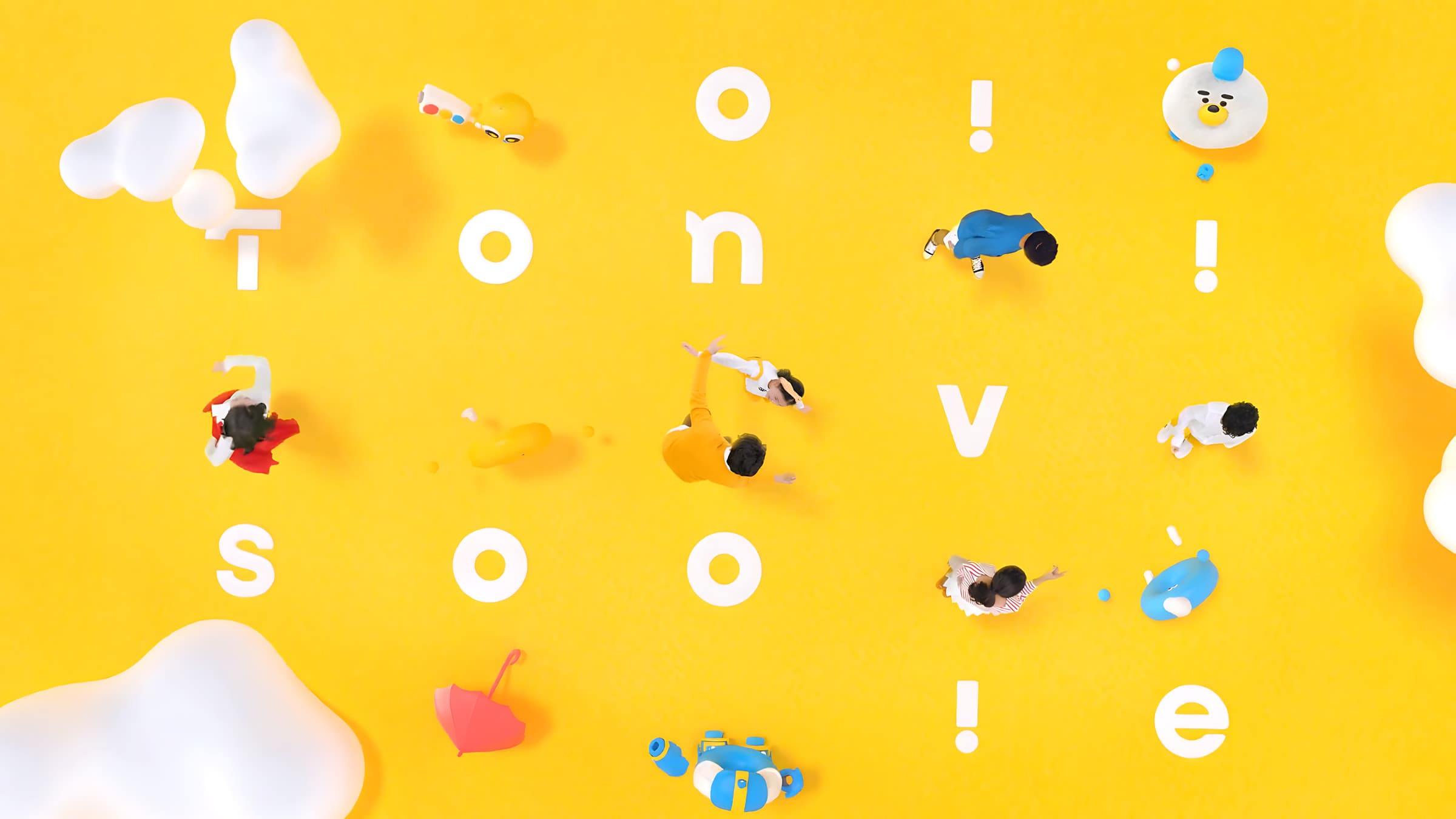
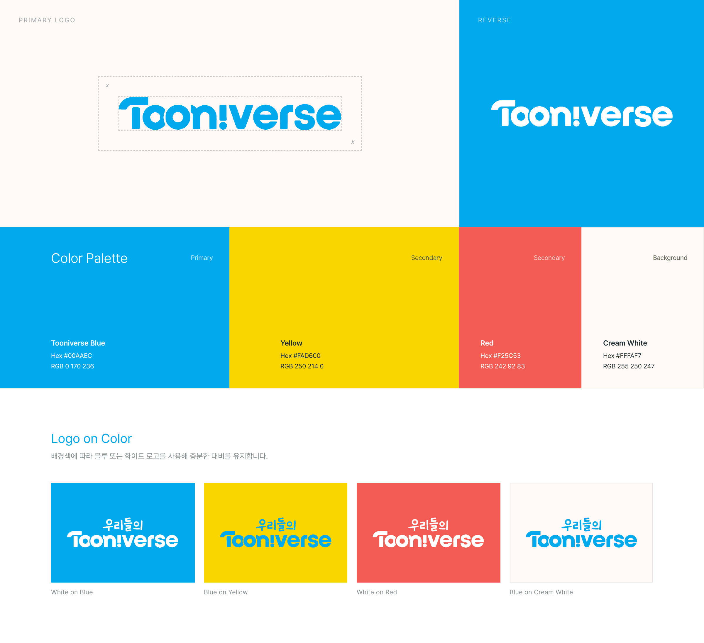
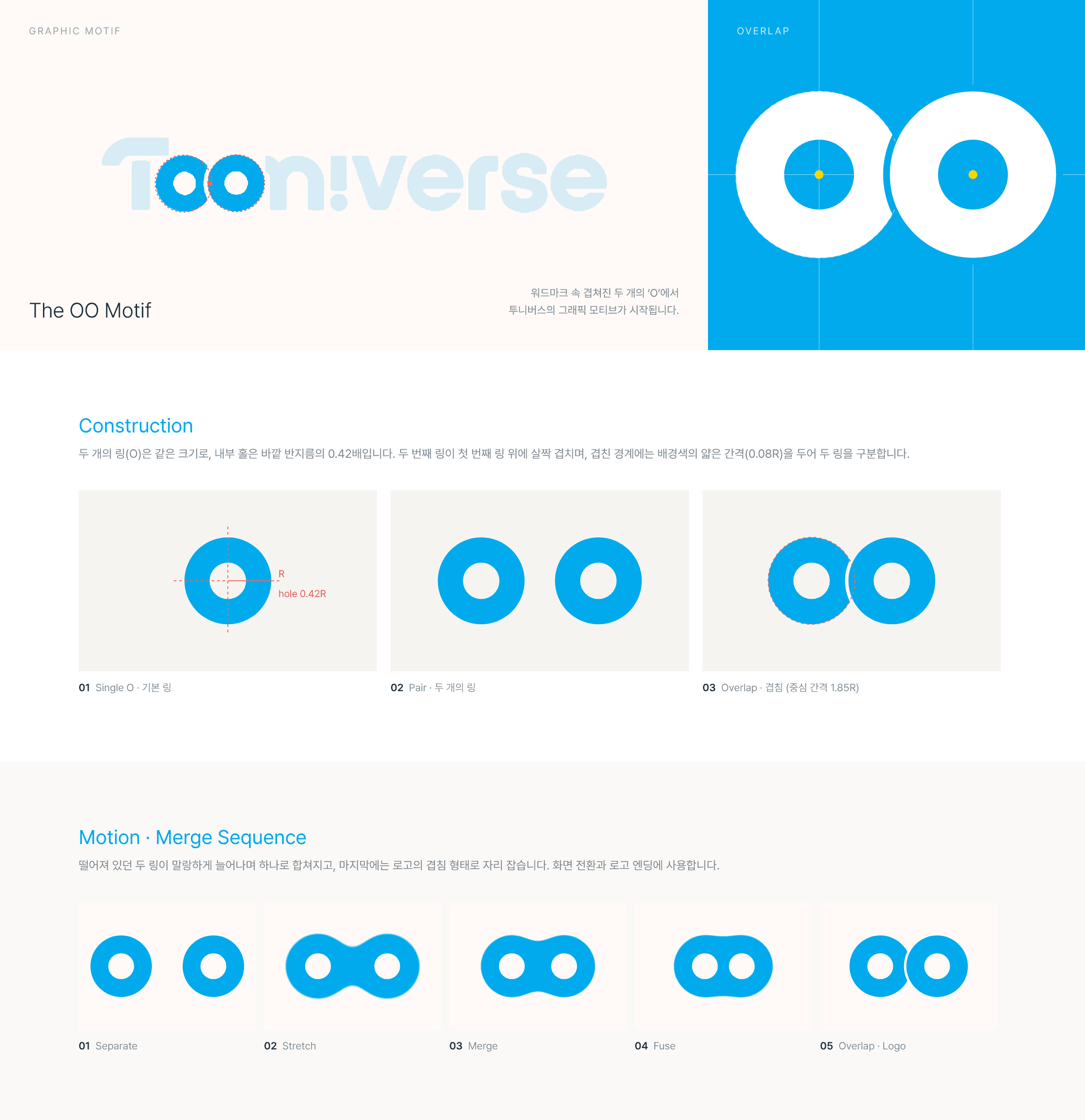
Blue was established as TOONIVERSE’s primary brand color, while the existing range of vibrant colors was reorganized into a structured secondary palette.Each color was assigned a clear role, allowing the system to flex across different content and graphic applications while creating a more recognizable and consistent TOONIVERSE identity.The existing TOONIVERSE logo was refined to improve legibility, balance, and overall visual precision, while preserving its recognizable identity.The new message, “우리들의 투니버스”, was consistently integrated across brand touchpoints to strengthen recognition of the new positioning and create a more memorable brand experience. TOONIVERSE를 대표하는 컬러로 Blue를 메인 컬러로 선정하고, 기존의 다채로운 컬러는 서브 컬러로 체계화했습니다.각 컬러에 명확한 역할을 부여해 다양한 콘텐츠와 그래픽에 유연하게 적용하면서도, TOONIVERSE만의 일관된 컬러 아이덴티티를 구축했습니다.기존 TOONIVERSE 로고의 아이덴티티는 유지하면서 가독성과 완성도를 높이는 방향으로 로고를 정교하게 다듬었습니다. 또한 ‘우리들의 투니버스’라는 메시지를 다양한 브랜드 접점에 반복적으로 노출해, 새로운 브랜드 포지셔닝과 슬로건이 자연스럽게 인식될 수 있도록 했습니다.