Homestory Rebrand
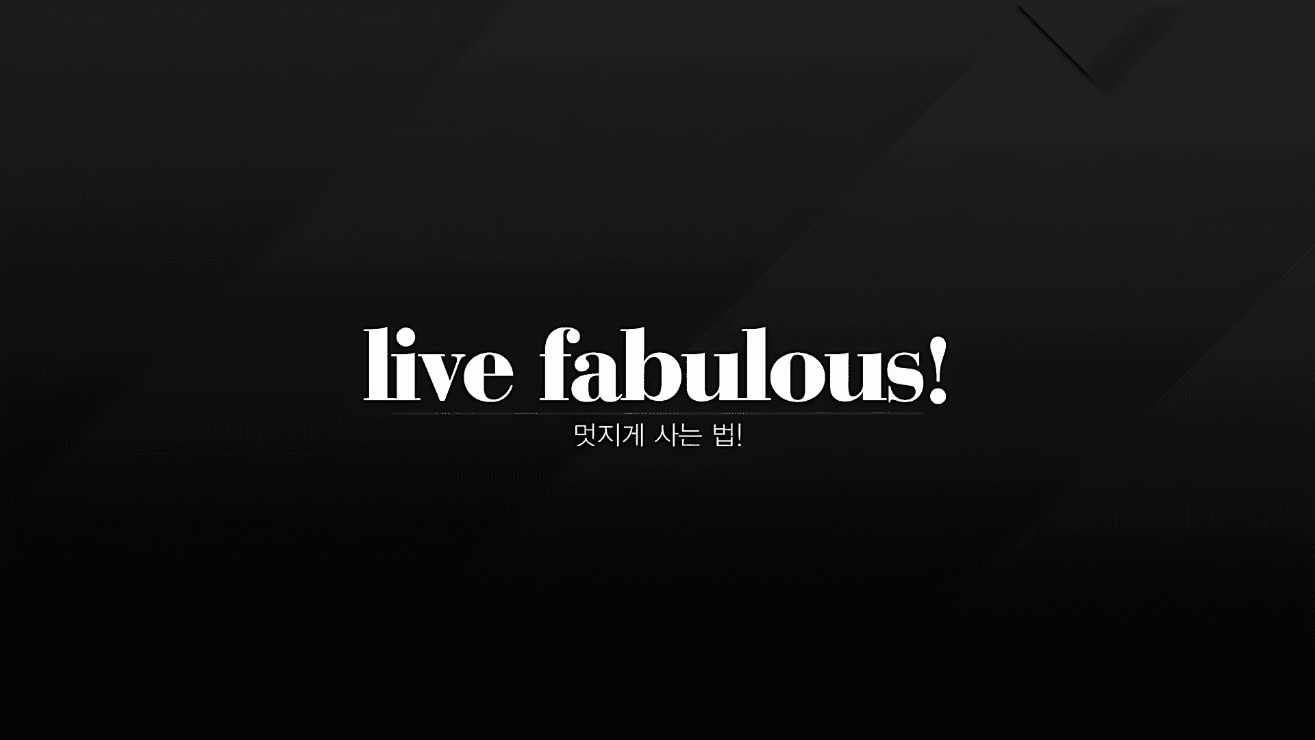
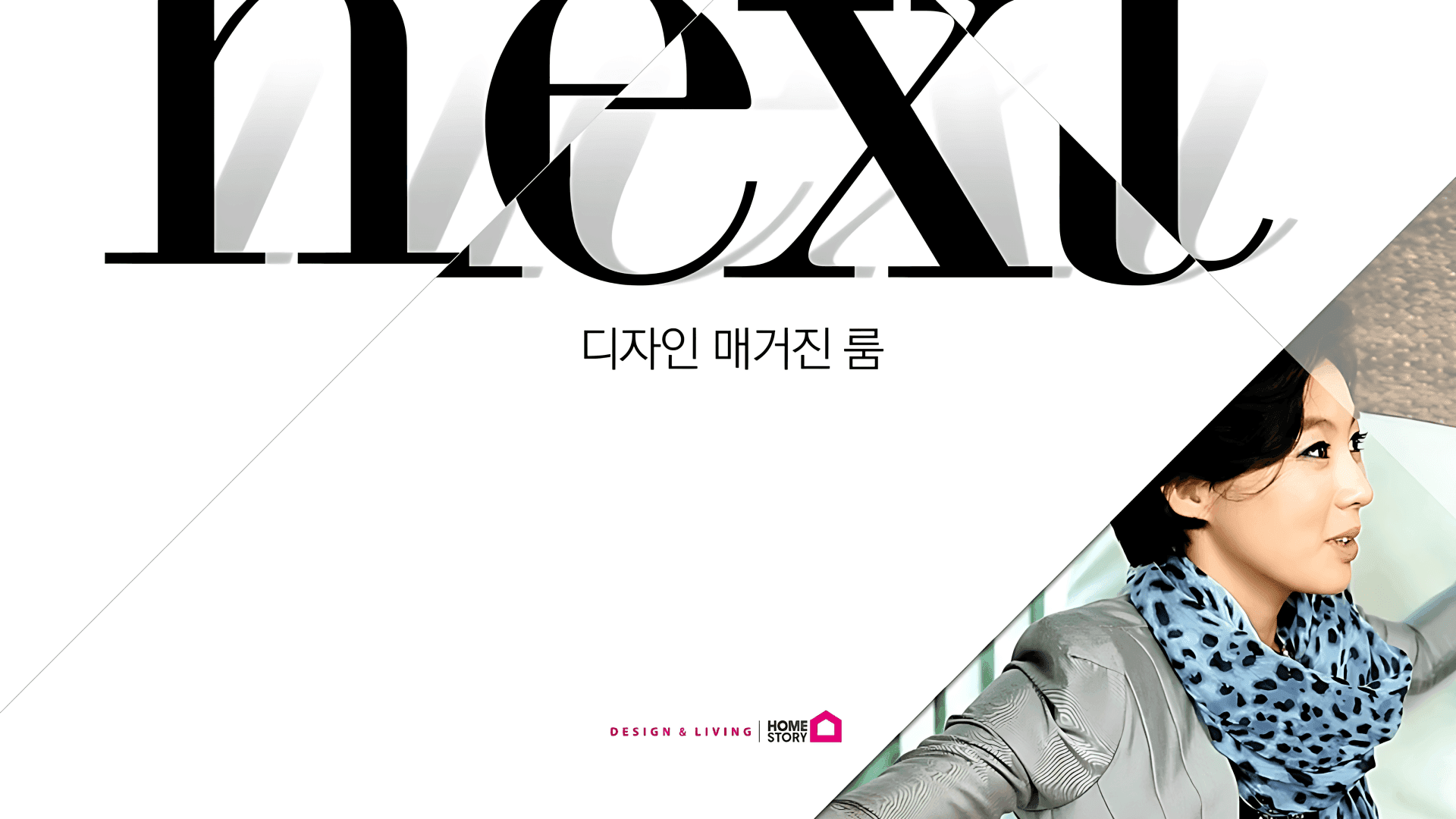
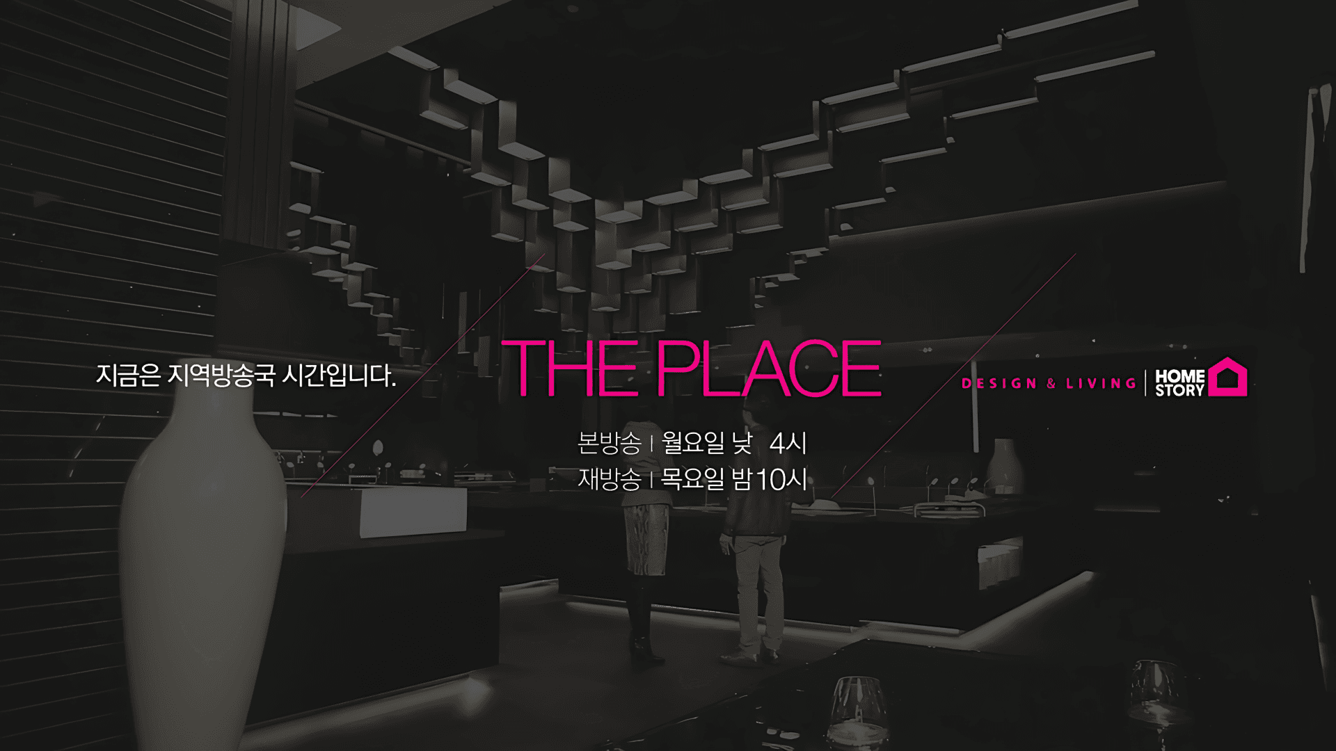
An in-house channel rebranding project that completely redefined the visual identity of HOMESTORY. Built around the new slogan “LIVE FABULOUS,” the channel was repositioned as a sophisticated interior design destination for an audience with a deeper appreciation of design and space.The entire project was developed and produced in-house. As Creative Director and Main Art Director, I led the overall creative direction, visual identity, and key broadcast graphics. HOMESTORY의 채널 아이덴티티를 전면적으로 재정의한 인하우스 채널 리브랜딩 프로젝트입니다. ‘LIVE FABULOUS’라는 새로운 슬로건을 중심으로, 단순한 인테리어 정보 채널을 넘어 디자인과 공간을 이해하는 사람들을 위한 감각적인 인테리어 채널로 포지셔닝했습니다.프로젝트 전 과정은 사내에서 100% 제작했으며, Creative Director 및 Main Art Director로서 전체 브랜딩 방향과 주요 비주얼, 방송 그래픽을 총괄했습니다.
- Role & Scope
- Creative Direction / Art Direction / Motion Graphics
- Category
- Channel Branding
- Year
- 2012
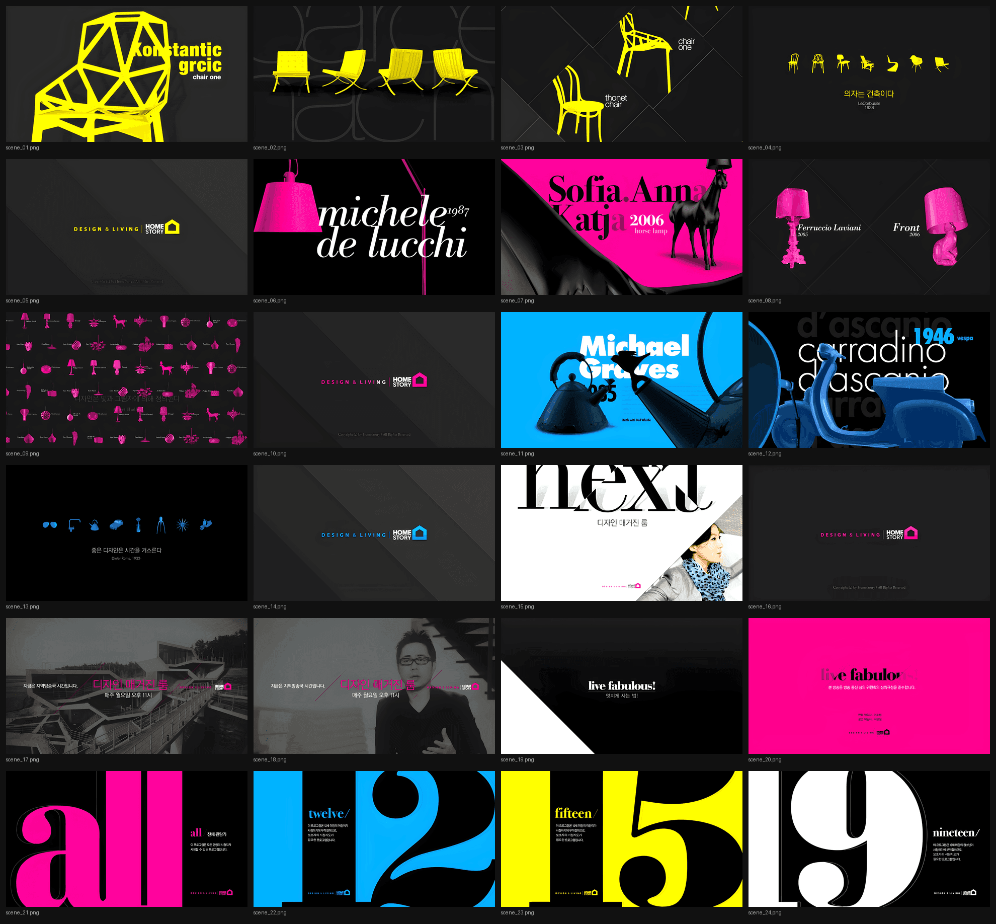
HOMESTORY was established as an interior and lifestyle channel, but its visual identity needed a stronger point of view to respond to the rapidly changing media landscape and growing expectations for design-driven content.Rather than simply refreshing the logo or broadcast graphics, the project aimed to establish the channel itself as a designed experience, creating a distinctive visual language across broadcast, digital, and physical touchpoints.At the time, the use of CMYK as a core channel branding system and the idea of connecting broadcast, digital, and offline experiences through a unified color language represented a forward-looking approach to channel branding. 기존 HOMESTORY는 인테리어와 라이프스타일을 다루는 채널이었지만, 변화하는 미디어 환경과 높아진 디자인 콘텐츠에 대한 기대에 비해 채널만의 강력한 시각적 인상이 부족했습니다.이에 단순히 로고나 그래픽을 변경하는 수준을 넘어, 방송 화면 자체가 하나의 디자인 경험이 될 수 있도록 채널의 시각적 언어를 새롭게 구축했습니다.당시로서는 방송 채널 브랜딩에 CMYK를 적극적으로 활용하고, 방송과 디지털, 오프라인 경험을 하나의 컬러 시스템으로 연결하는 접근은 상당히 선도적인 시도였습니다.
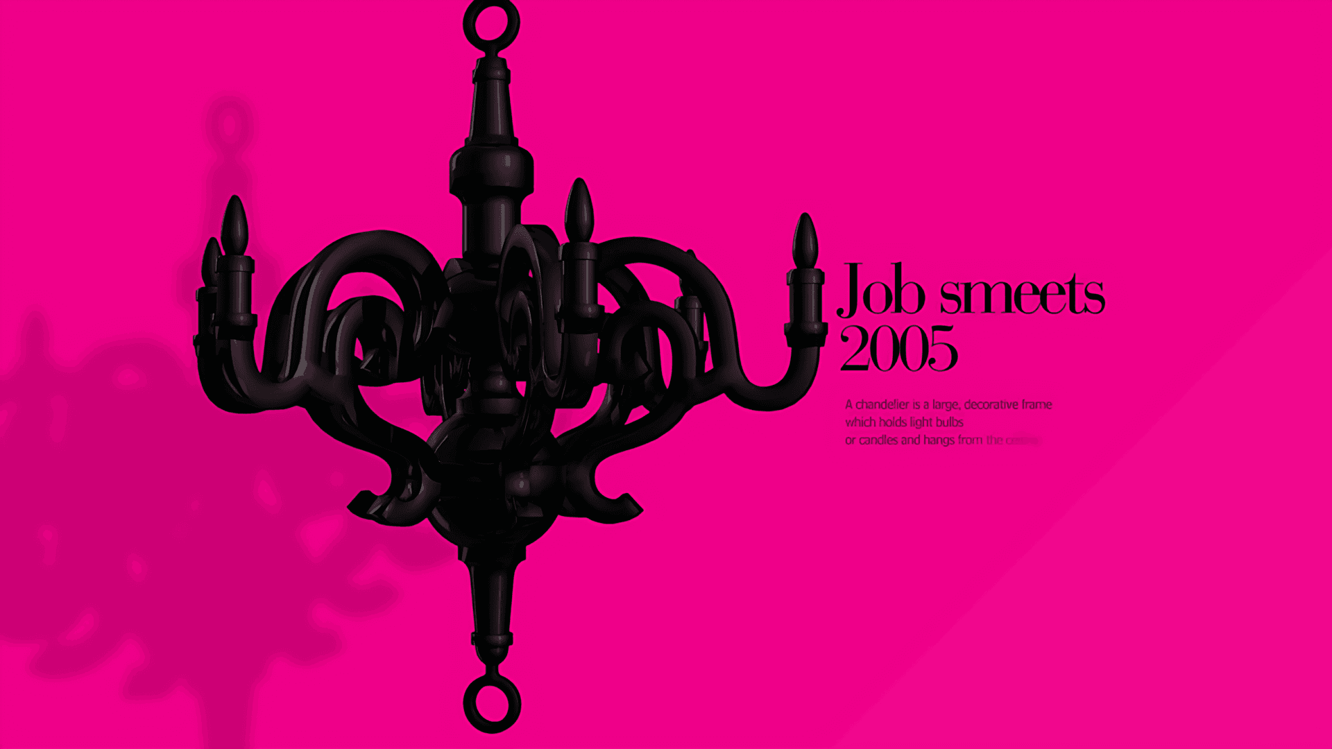
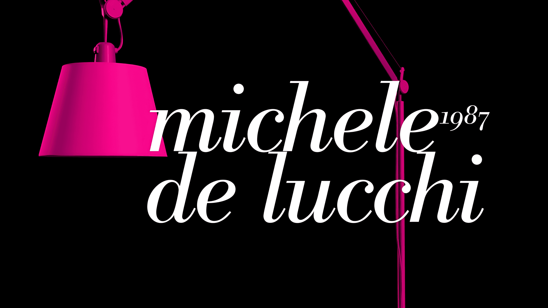
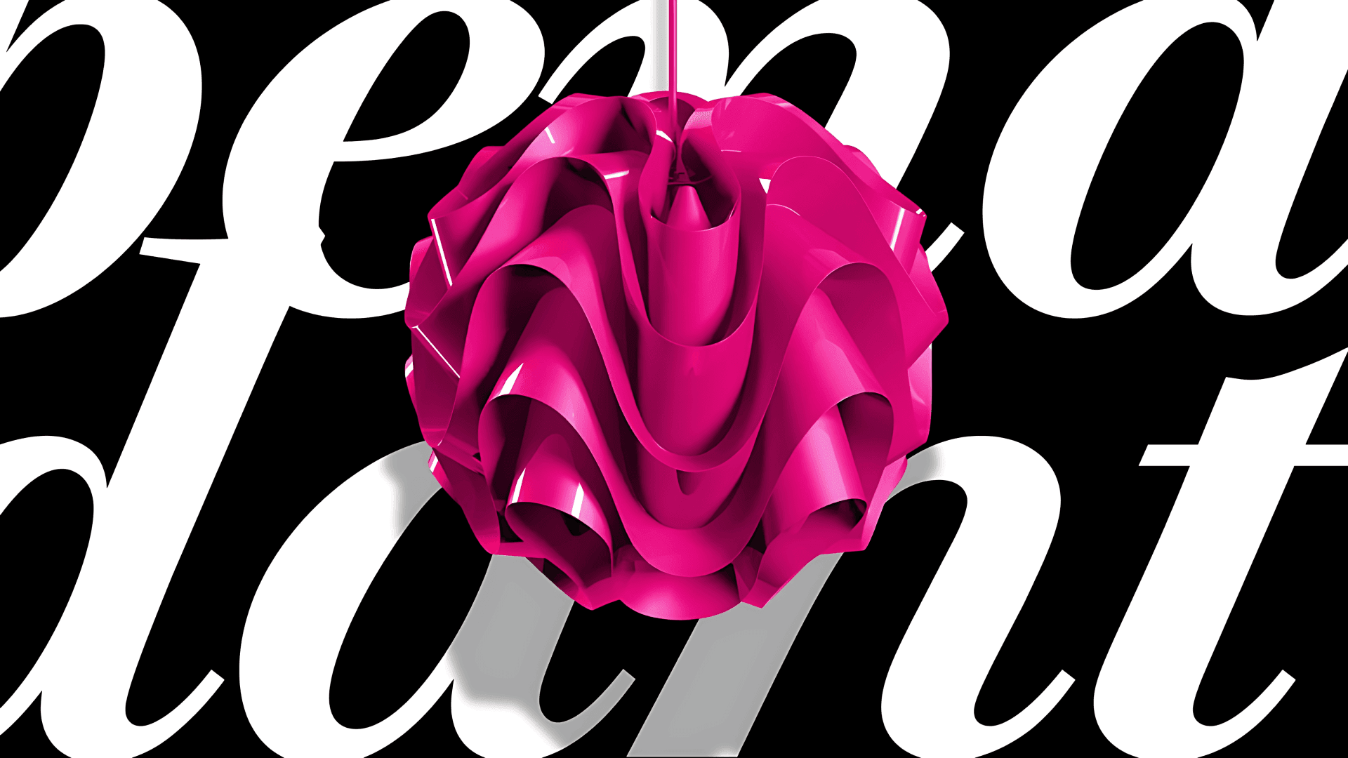
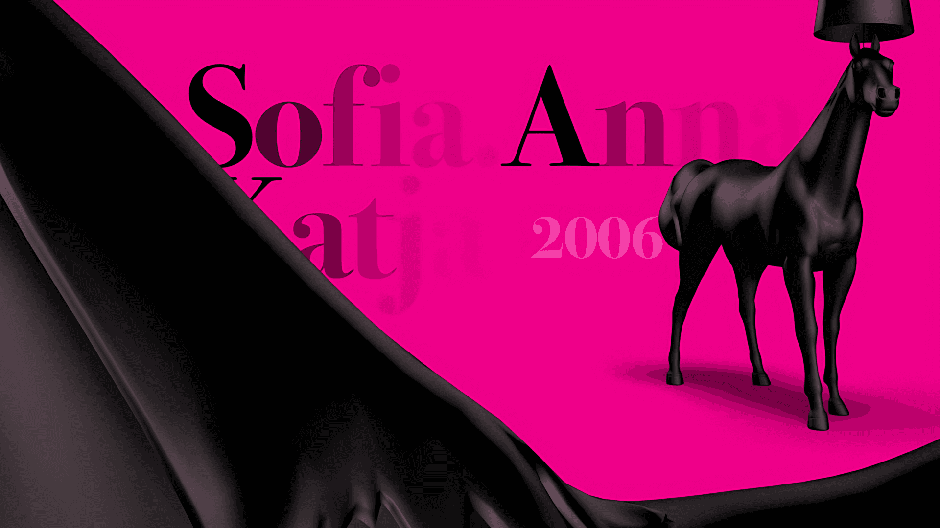
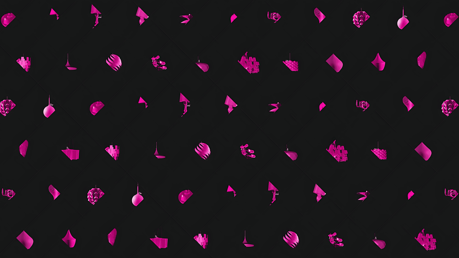
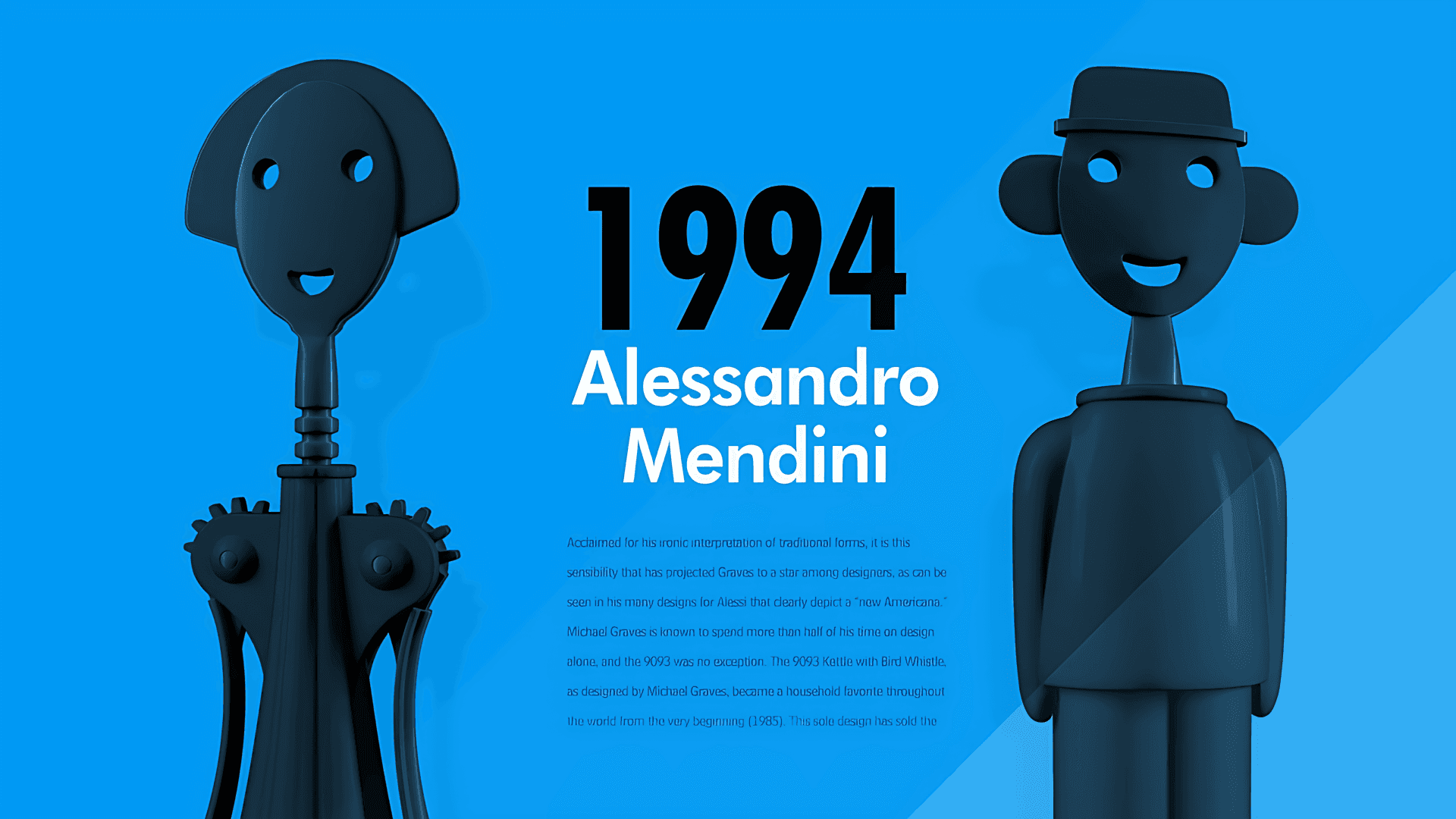
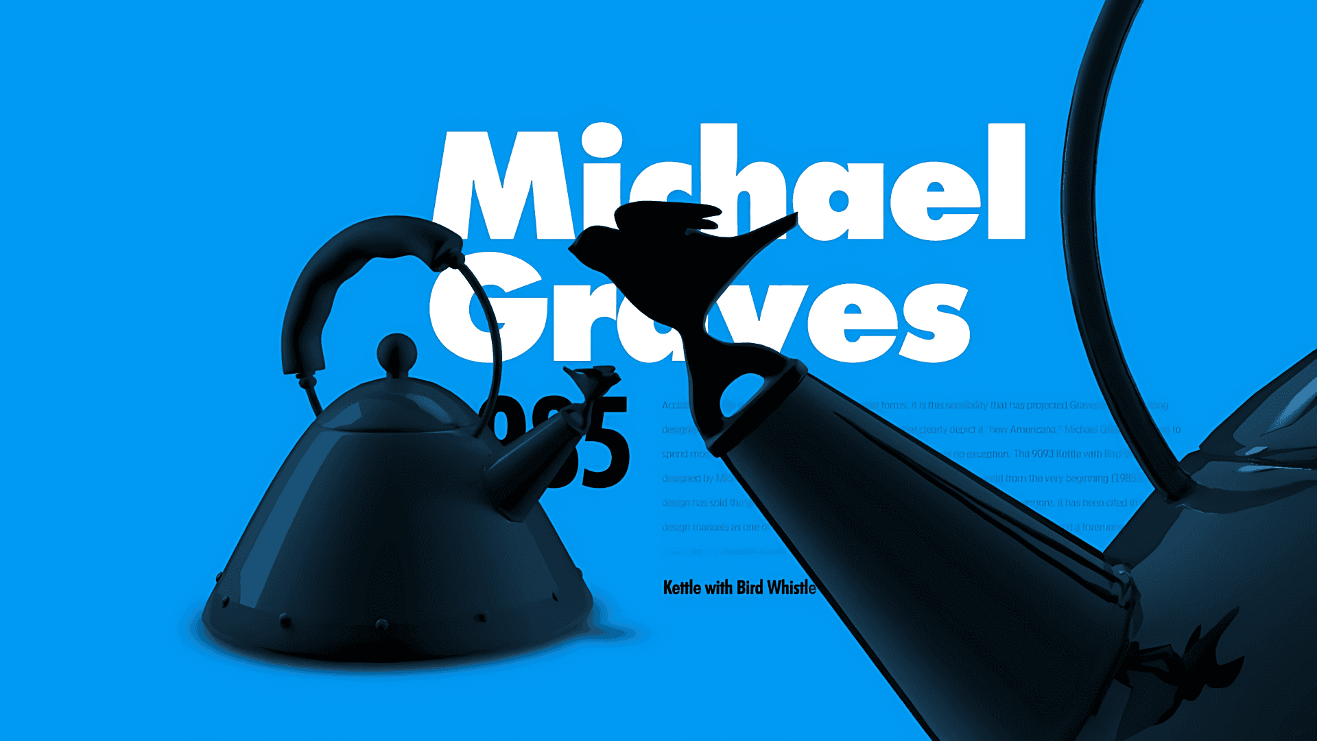
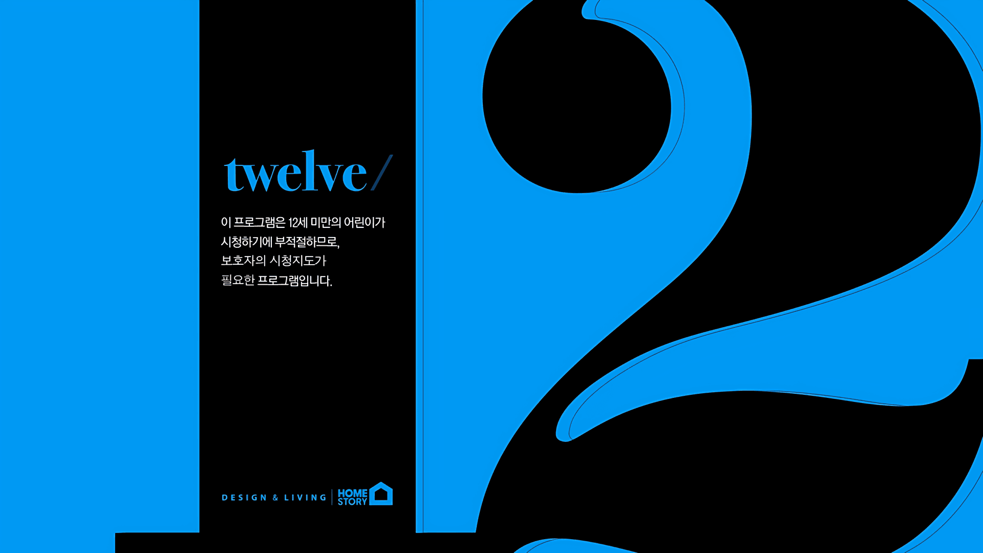
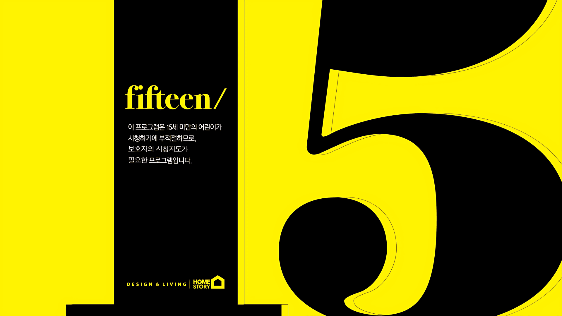
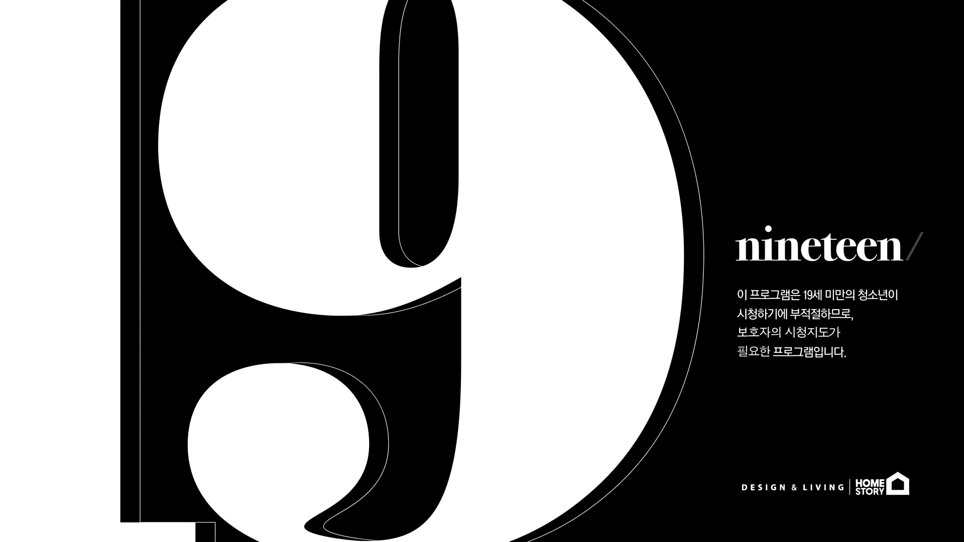
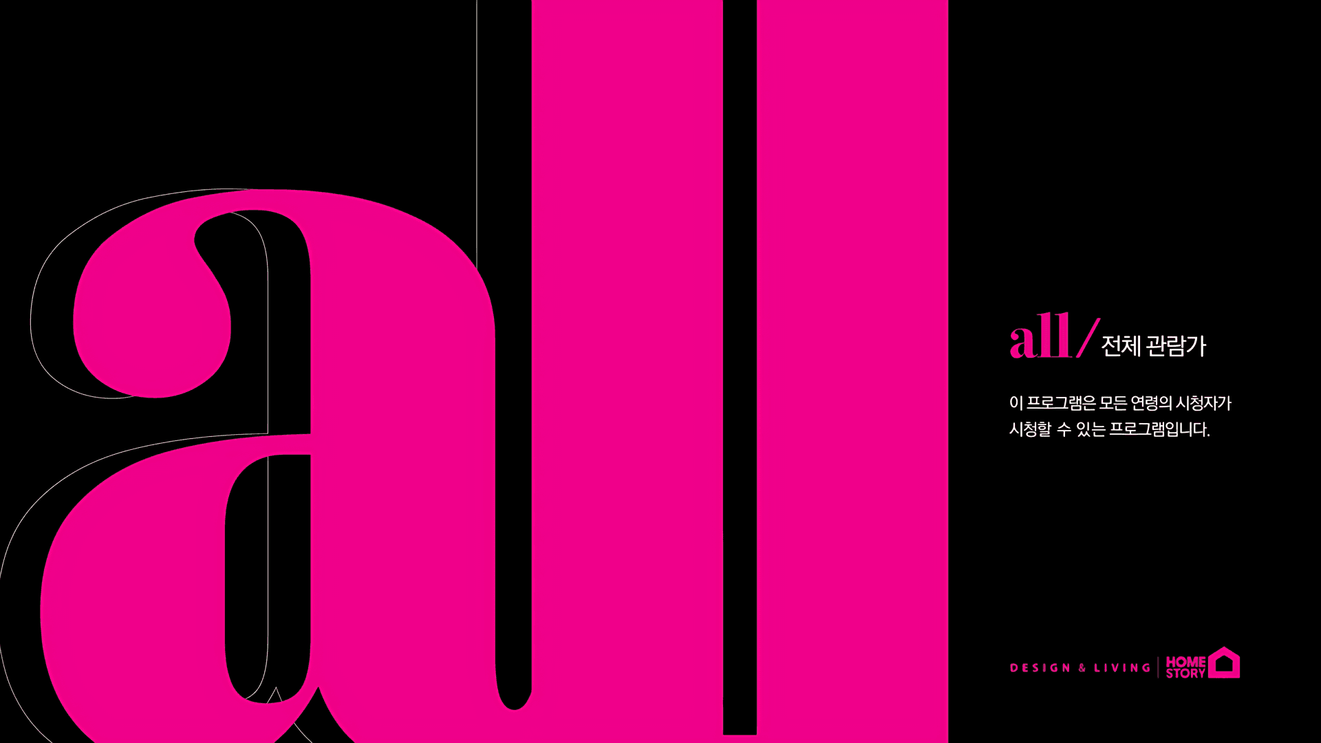
Built around the slogan “LIVE FABULOUS,” the new identity positions HOMESTORY as an interior channel that inspires a more beautiful and design-conscious way of living.CMYK was established as the core color system, with each color designed to work independently as well as in combination. This created a flexible visual language that could move seamlessly between broadcast graphics, digital content, and offline environments.The existing HOMESTORY logo was retained as a core brand asset, while its colors, graphic language, and overall visual style were completely redefined to establish a new channel identity. ‘LIVE FABULOUS’라는 슬로건을 바탕으로 더 아름답고, 더 감각적인 삶을 제안하는 인테리어 채널이라는 브랜드 이미지를 구축했습니다.채널의 메인 컬러로 CMYK를 설정하고, 각각의 컬러가 독립적으로 존재하면서도 서로 조합될 수 있도록 시스템화했습니다. 이를 통해 방송 화면뿐 아니라 온라인 콘텐츠와 오프라인 공간까지 동일한 컬러 언어로 연결하고자 했습니다.기존 HOMESTORY 로고는 브랜드 자산으로 유지하되, 컬러와 그래픽 스타일을 전면적으로 개편해 새로운 채널 이미지에 맞게 재해석했습니다.