Cafe Wild Wind
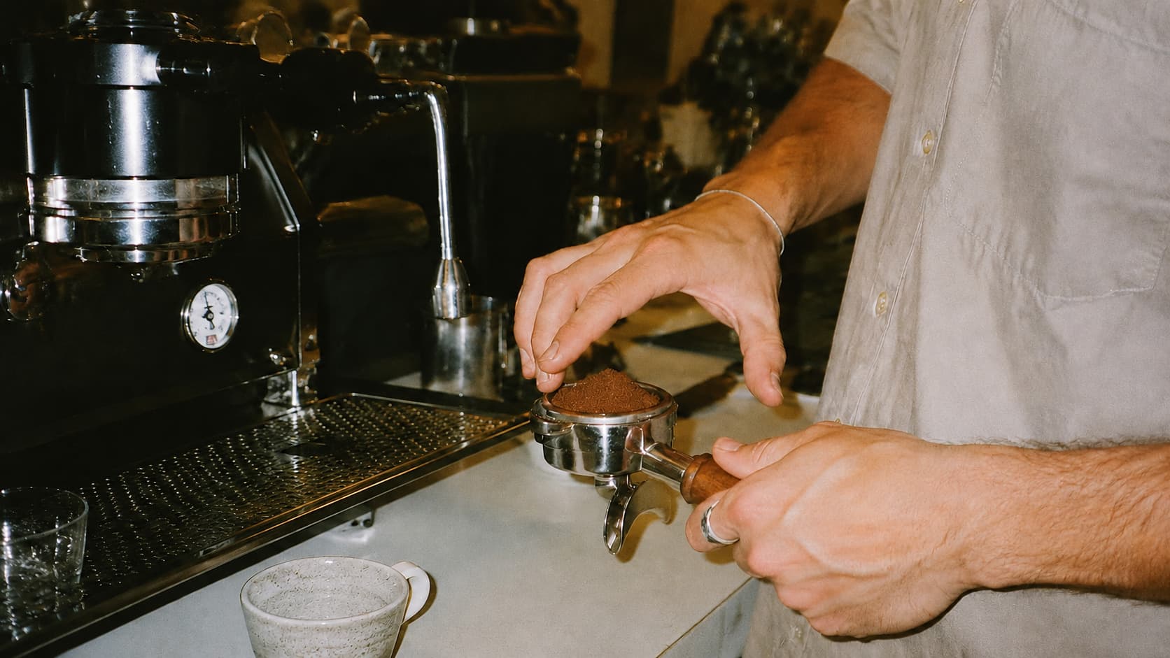
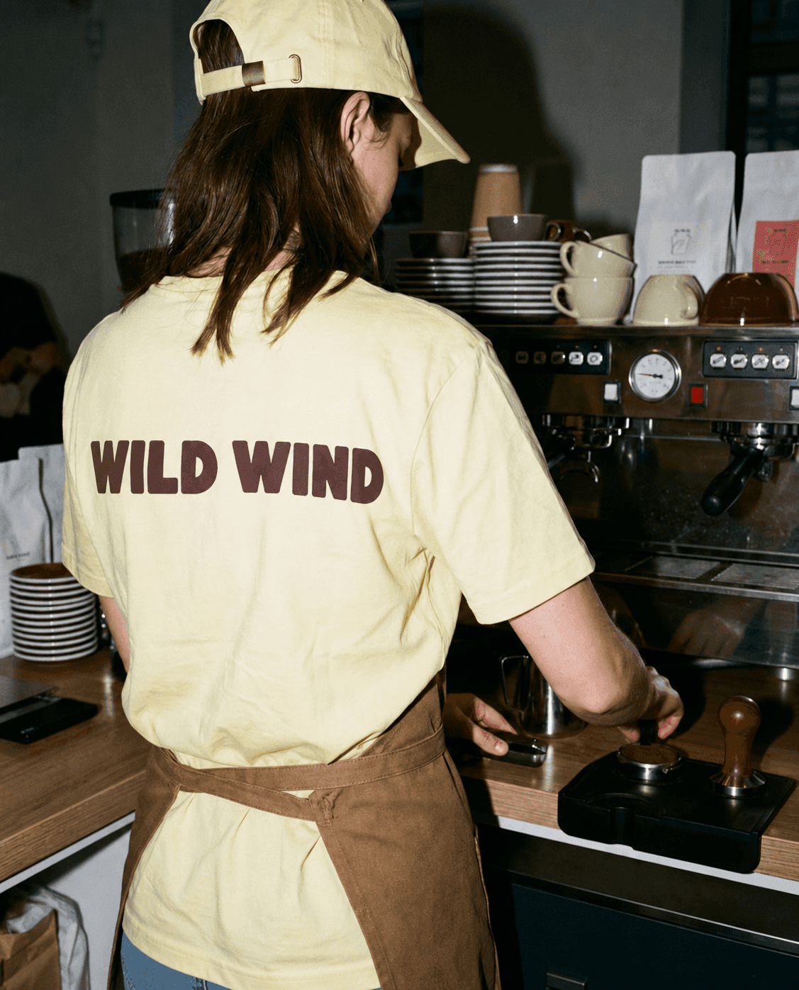
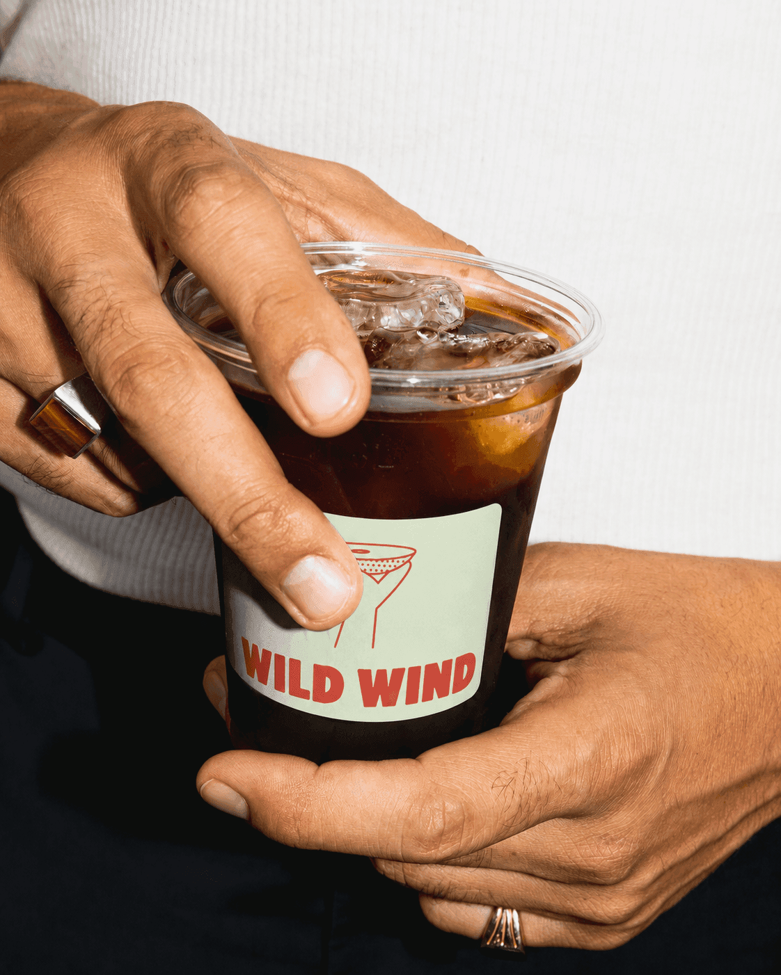
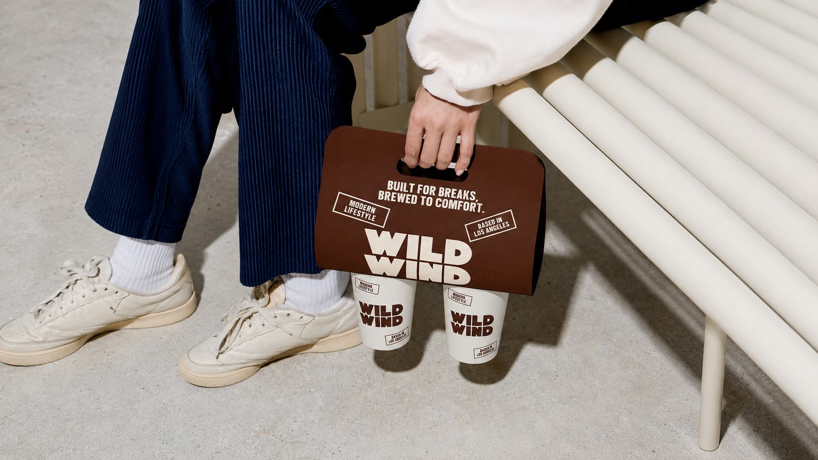
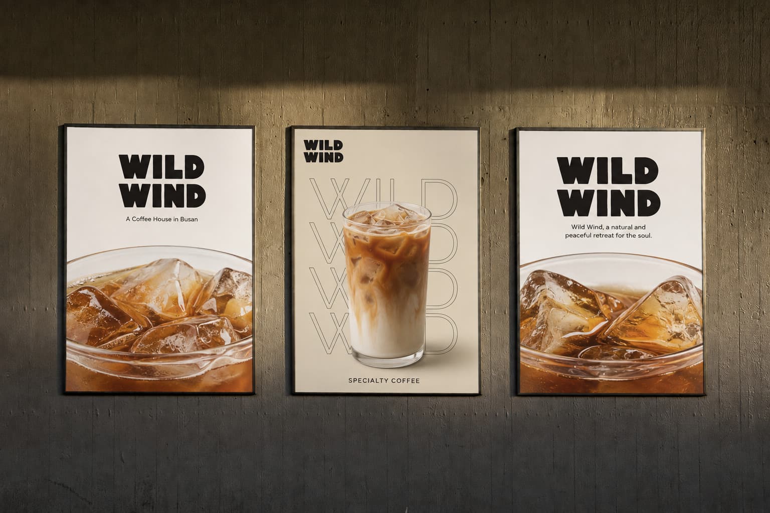
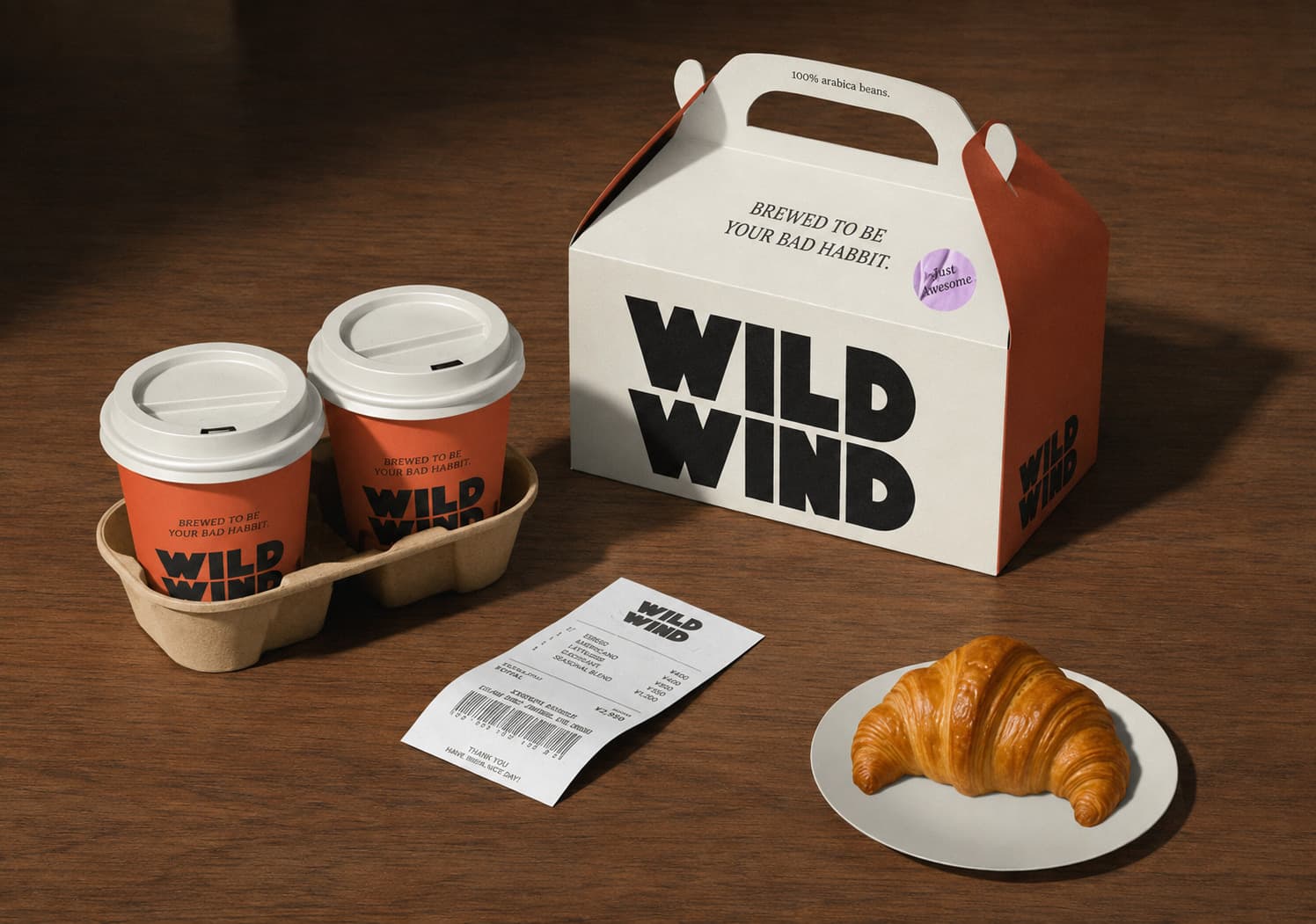
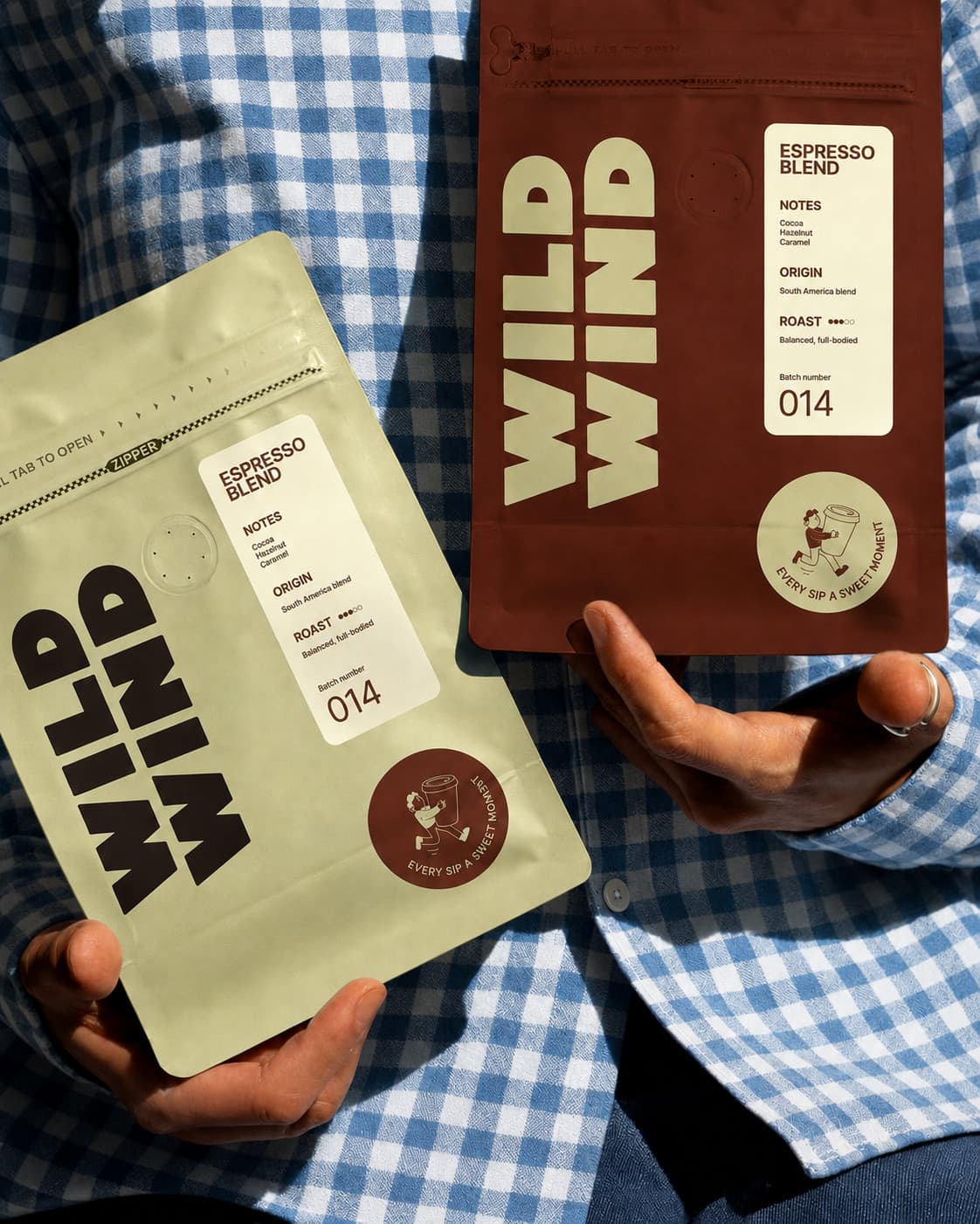
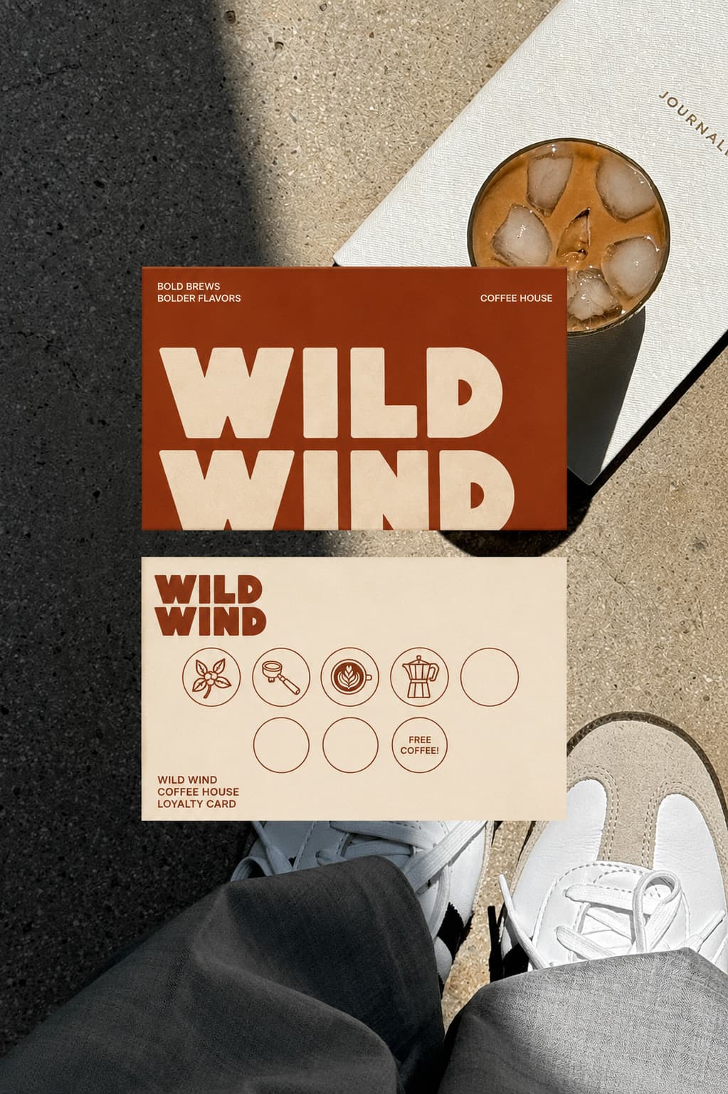
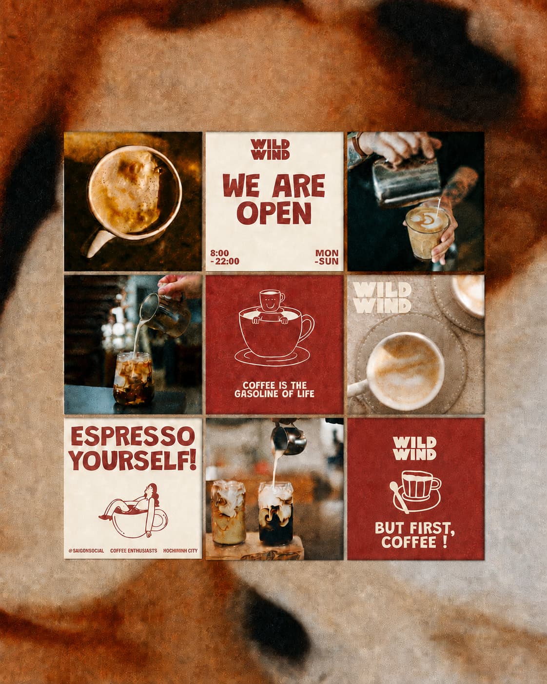
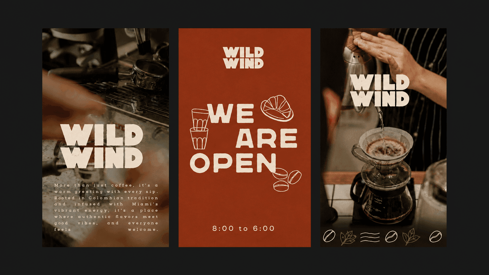
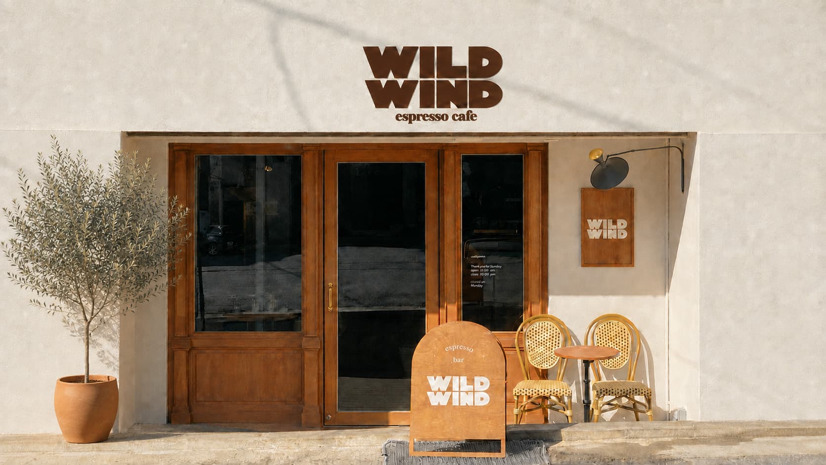
WILD WIND is a coffee brand project inspired by the sensory experience of coffee, its aroma, warmth, and the quiet moments found in between. Built around earthy brown tones, warm materials, and restrained graphics, the identity creates a cohesive brand experience across the logo, packaging, space, and various visual touchpoints. WILD WIND는 커피가 가진 향과 온도, 그리고 잠시 머물며 느끼는 여유로운 순간을 감각적인 비주얼로 표현한 커피 브랜드 프로젝트입니다. 자연에서 영감을 받은 브라운 컬러와 따뜻한 소재, 절제된 그래픽을 중심으로 로고부터 패키지, 공간과 다양한 브랜드 접점까지 일관된 아이덴티티를 구축했습니다.
- Role & Scope
- Art Direction / Logo & Visual Identity
- Category
- Personal Project / Work in progress
- Year
- 2024
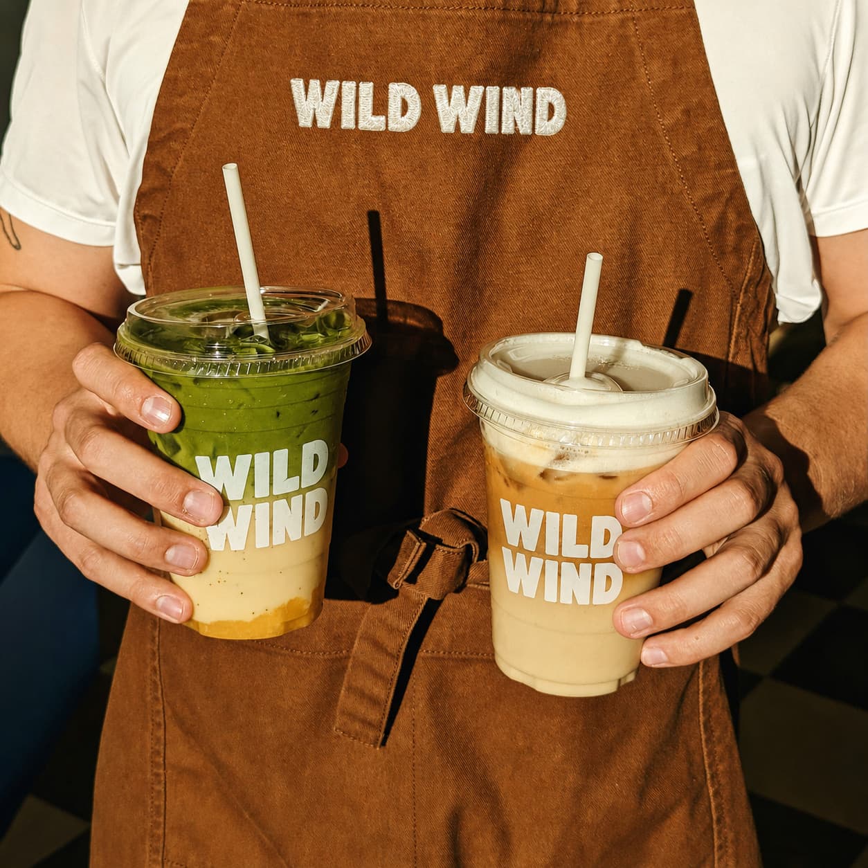
Coffee has evolved beyond a simple beverage into an experience that connects people, places, personal taste, and time. WILD WIND began with the idea of creating a brand where the moment of drinking coffee could become as memorable as the coffee itself.Rather than following short-lived visual trends, the project focuses on building a timeless visual language that can maintain a consistent atmosphere across packaging, physical spaces, and everyday brand touchpoints. 커피는 단순히 마시는 음료를 넘어 공간과 사람, 취향과 시간을 연결하는 경험이 되었습니다. WILD WIND는 빠르게 소비되는 일상적인 커피 브랜드에서 벗어나, 한 잔의 커피를 마시는 순간 자체가 기억에 남을 수 있는 브랜드를 만드는 것에서 출발했습니다.트렌드를 그대로 따르기보다 시간이 지나도 자연스럽게 유지될 수 있는 시각적 언어를 구축하고, 다양한 패키지와 공간에서도 브랜드의 분위기를 일관되게 전달하는 것을 목표로 했습니다.
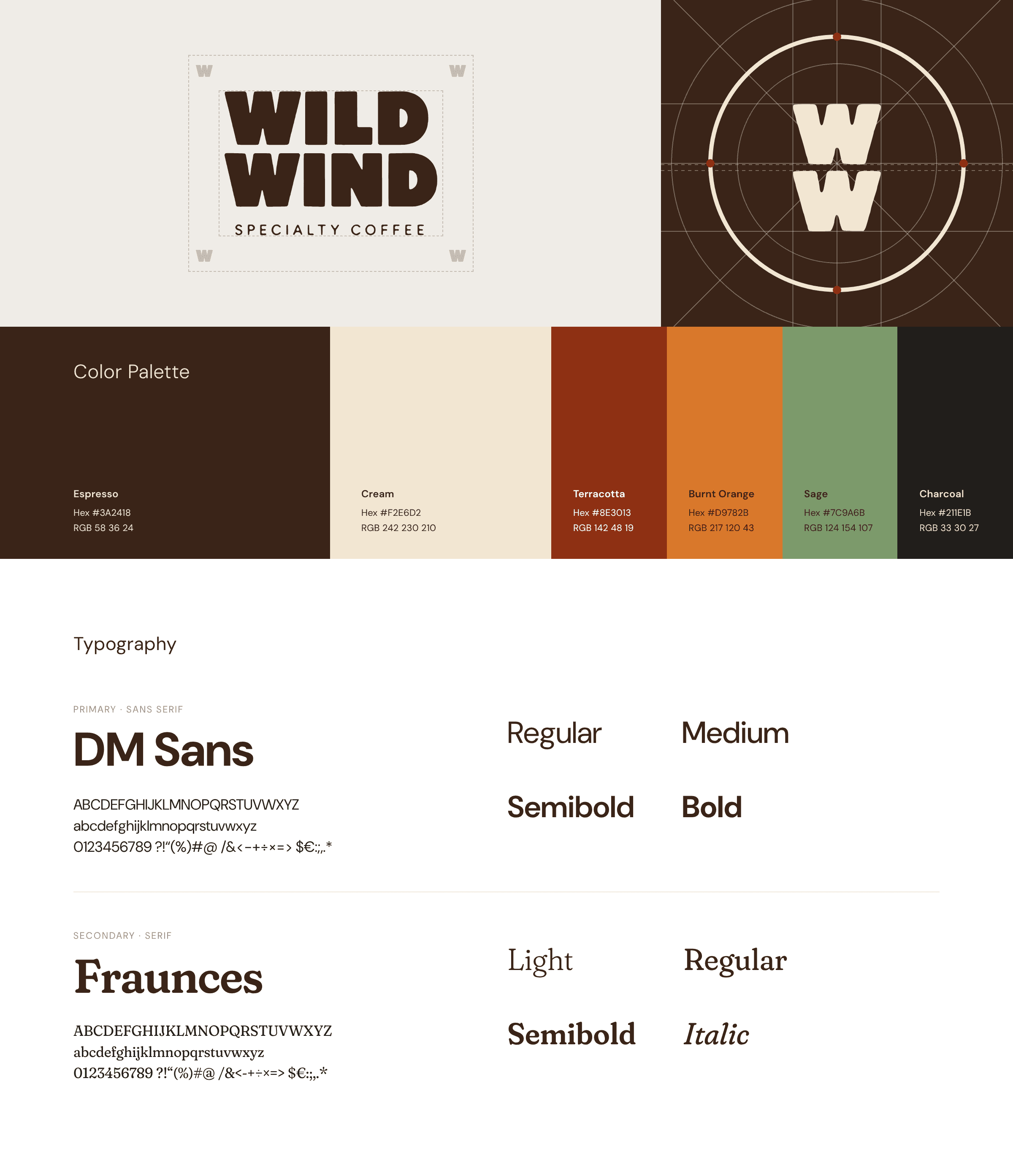
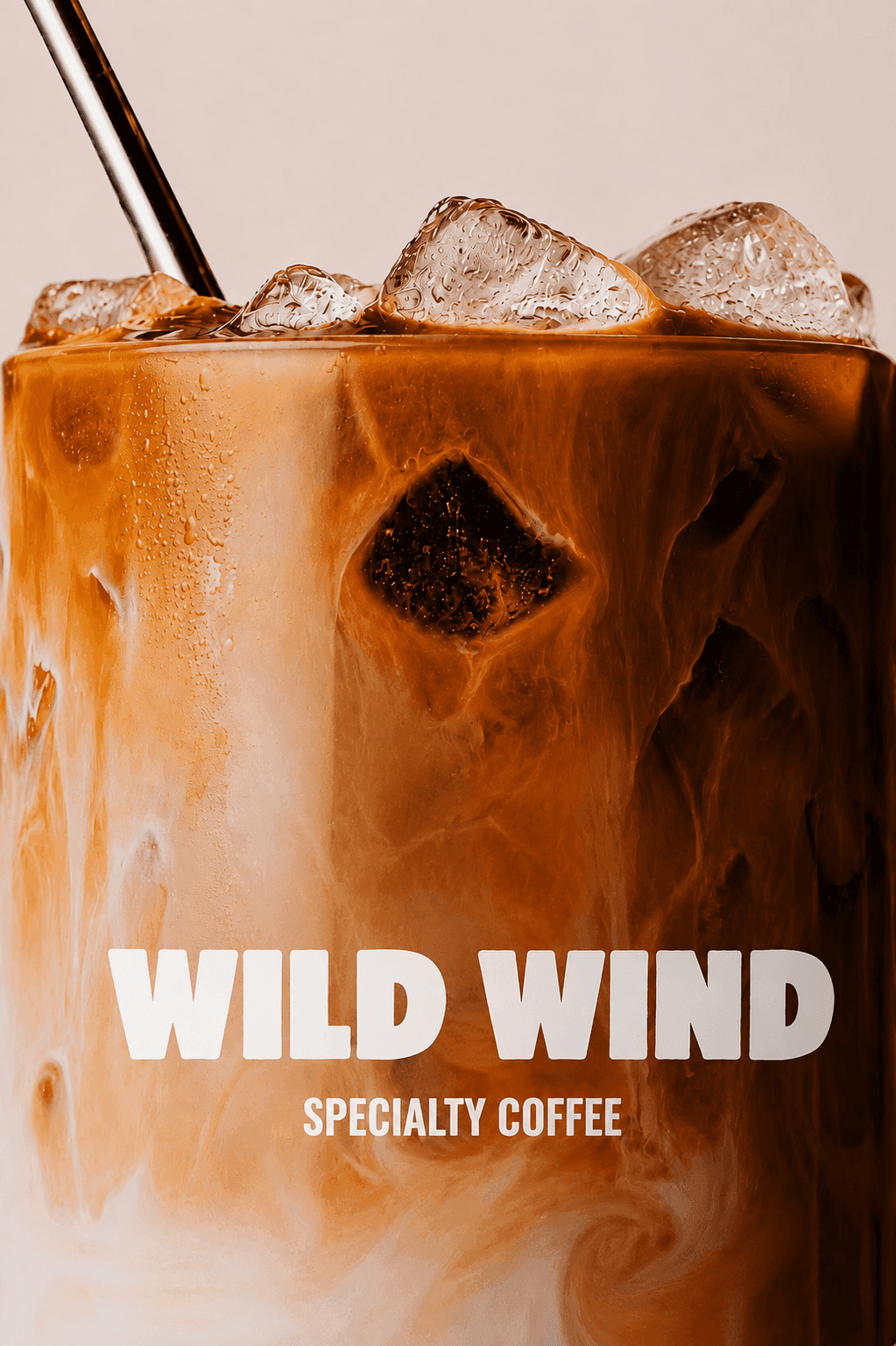
“A Moment Carried by the Wind.” Inspired by the name WILD WIND, the identity takes cues from the free-flowing movement of wind and the organic character of nature.A warm brown palette drawn from the natural tones of coffee is paired with tactile materials such as wood and paper. Minimal typography, generous space, and understated graphics create an atmosphere that feels relaxed yet refined.Subtle messages and organic graphic elements bring warmth and personality to the system without making the brand feel overly polished or formal. WILD WIND is designed not simply as a place to buy coffee, but as a brand that invites people to slow down, pause, and enjoy a moment of their own. ‘WILD WIND’라는 이름에서 연상되는 자유롭게 흐르는 바람과 자연의 움직임을 브랜드의 핵심 이미지로 설정했습니다.커피 원두가 가진 자연적인 색감에서 가져온 브라운 컬러를 중심으로 우드와 종이 등 따뜻한 소재를 조합하고, 간결한 타이포그래피와 여백을 활용해 편안하지만 세련된 분위기를 구축했습니다.브랜드가 지나치게 정제되거나 무겁게 느껴지지 않도록 자연스러운 그래픽과 작은 메시지들을 곳곳에 적용했습니다. 이를 통해 WILD WIND를 단순히 커피를 판매하는 브랜드가 아니라, 커피와 함께 잠시 속도를 늦추고 자신만의 시간을 경험하는 브랜드로 표현하고자 했습니다.