Preppers Renewal
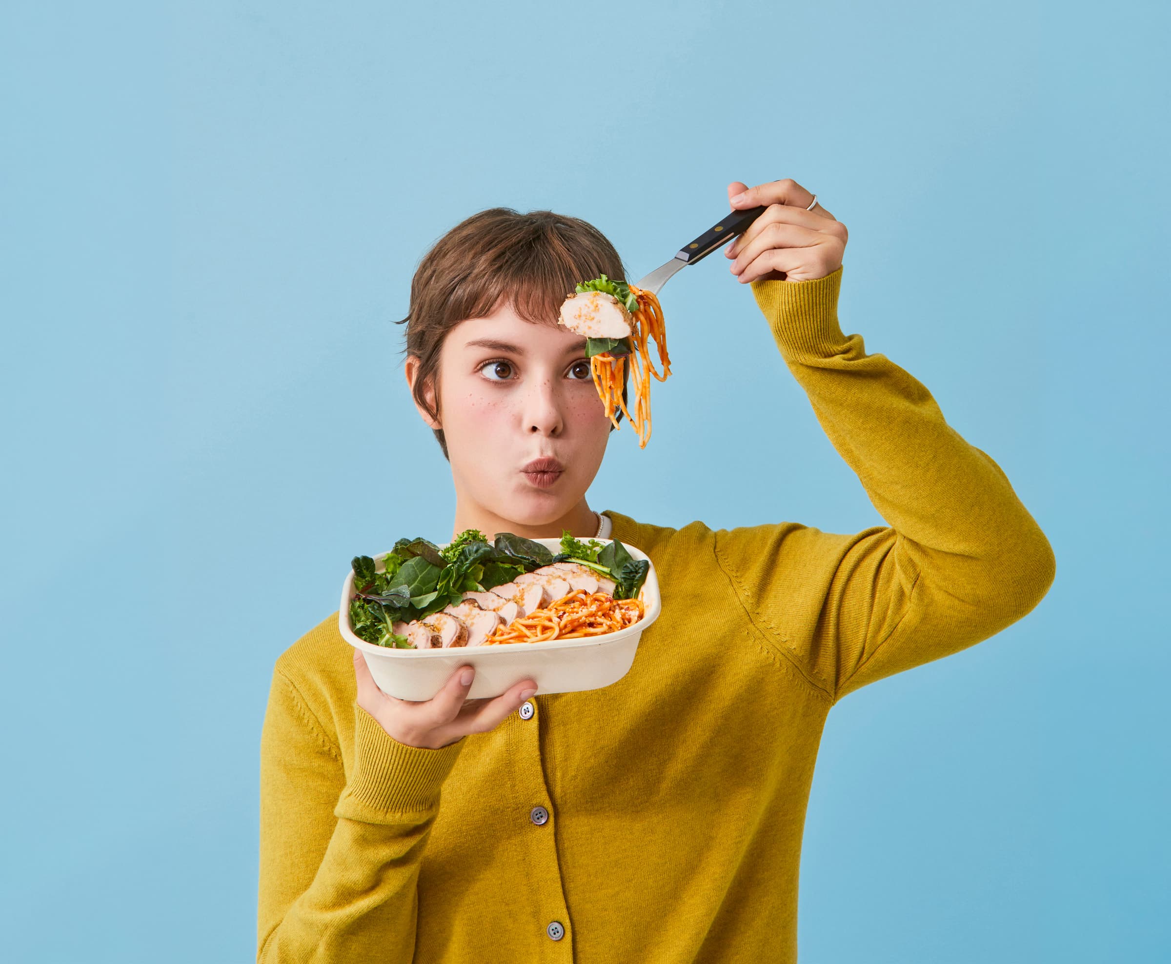
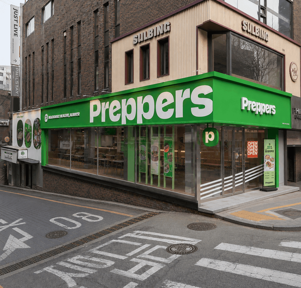
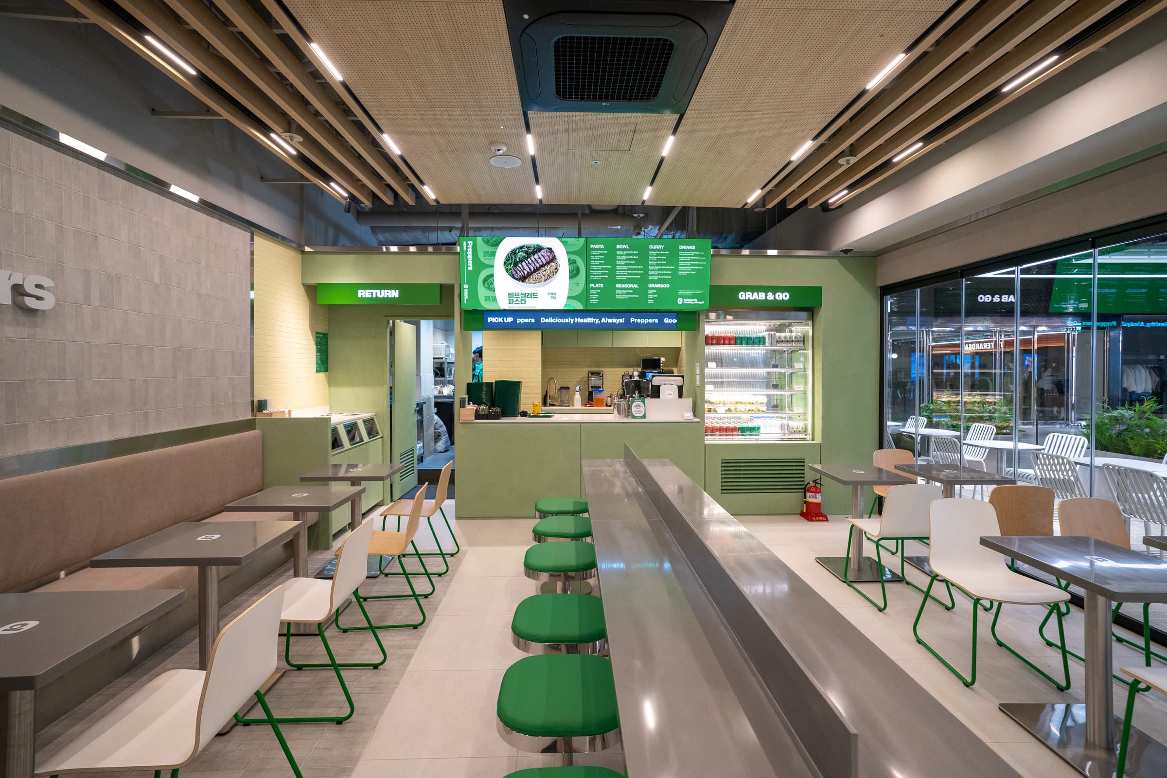
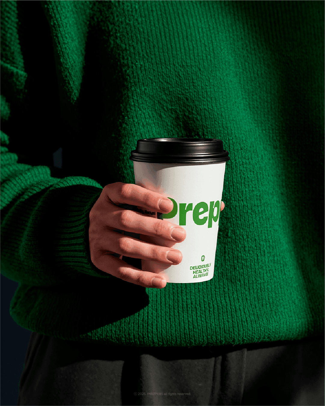
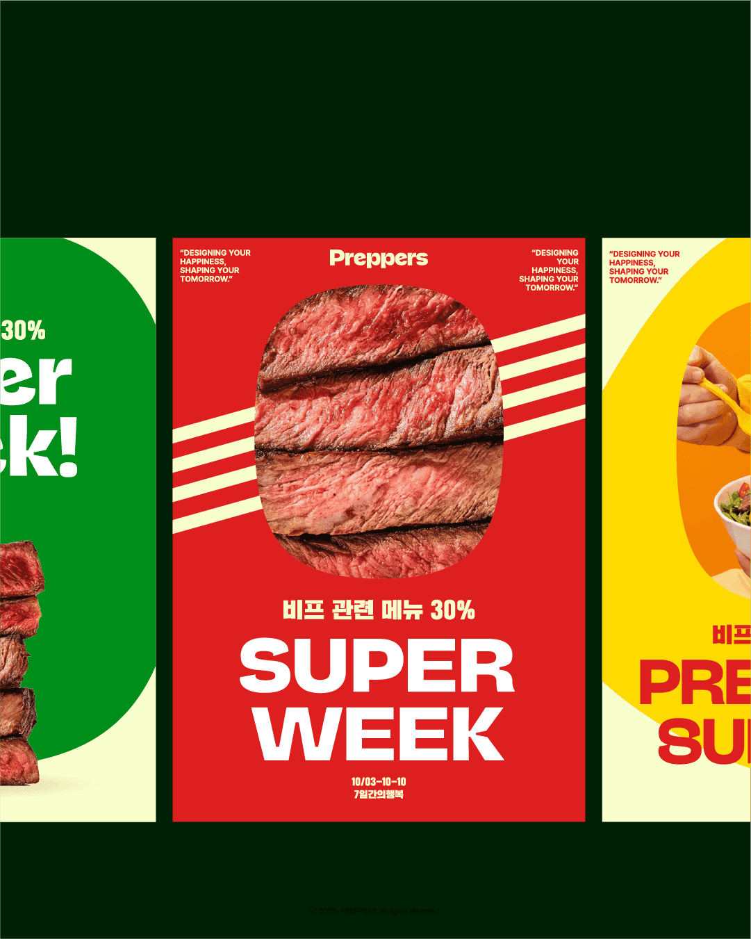
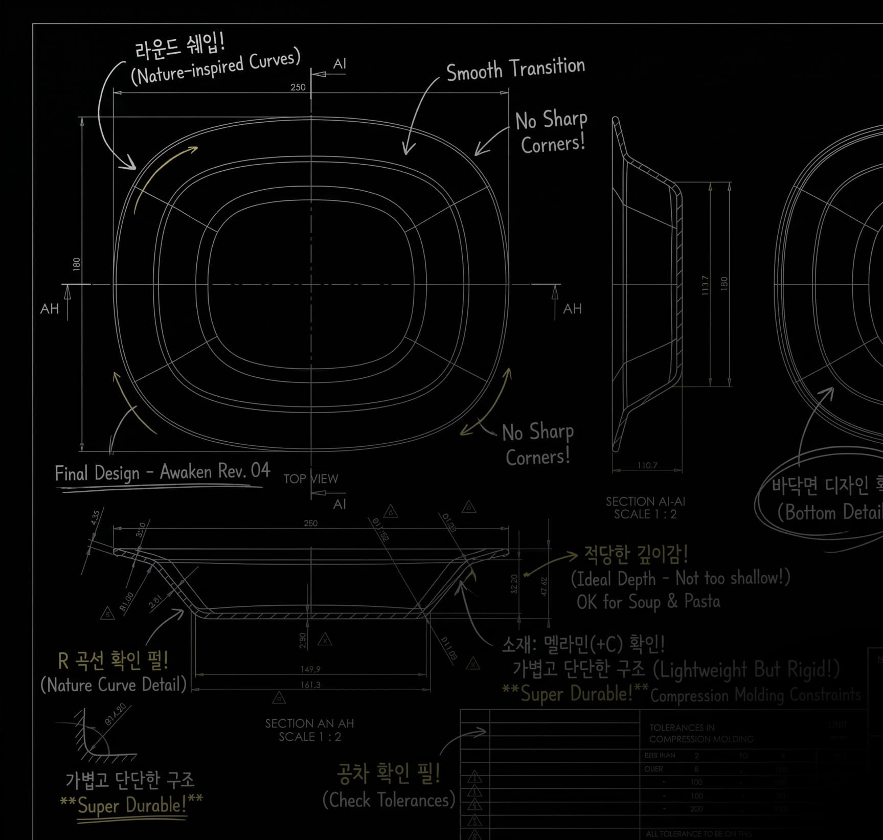
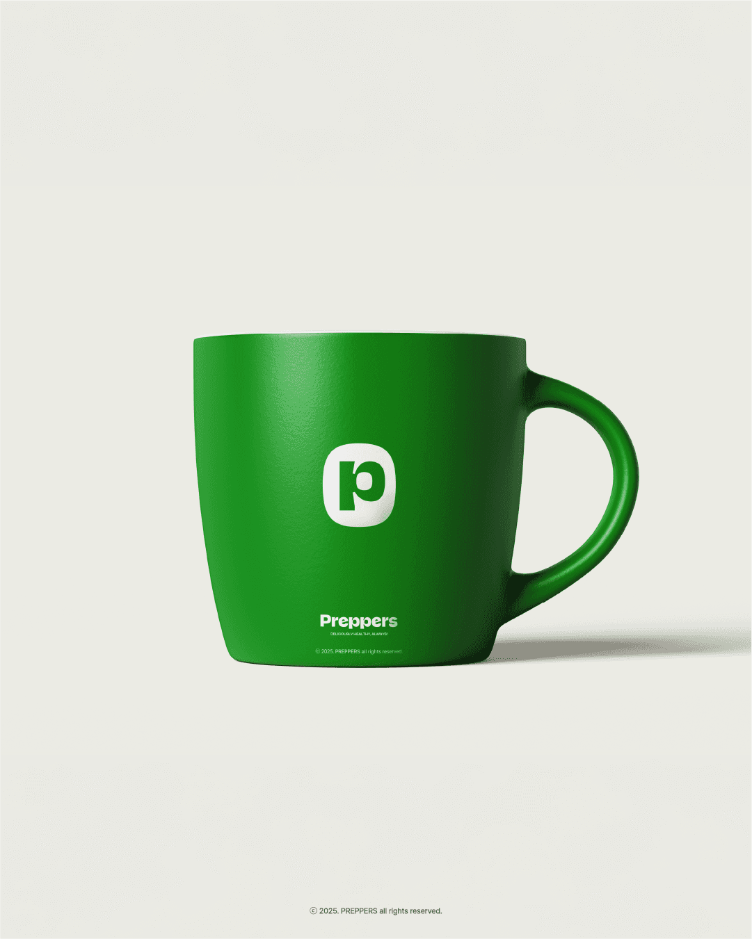
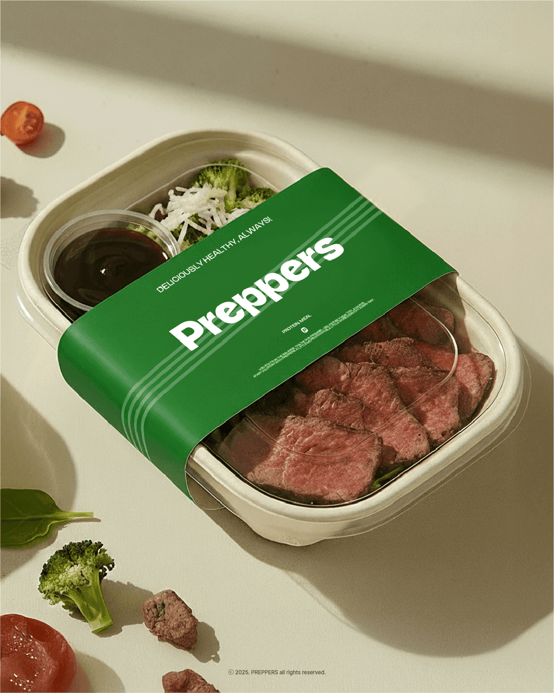
A brand renewal project for PREPPERS, a diet-focused food brand, redefining its visual identity and in-store experience. From the logo and color palette to graphic applications and spatial design, the project establishes a cohesive brand experience across every touchpoint. 다이어트 푸드 브랜드 프레퍼스의 시각적 아이덴티티와 매장 경험을 새롭게 정비한 브랜드 리뉴얼 프로젝트입니다. 로고부터 컬러, 그래픽 시스템, 공간까지 하나의 일관된 브랜드 경험으로 연결했습니다.
- Role & Scope
- Art Direction · Logo & Visual Identity · Graphic System · Packaging · Signage & Spatial Branding
- Category
- Brand Renewal
- Year
- 2026
PREPPERS previously lacked a consistent visual language. Its tilted logo, complex graphic elements, and fragmented applications made the brand difficult to recognize as a unified identity. The same inconsistency extended to its retail spaces, where stores lacked a cohesive visual and spatial direction. 기존 프레퍼스는 기울어진 형태의 로고와 복잡한 그래픽 요소, 일관되지 않은 디자인으로 인해 브랜드의 명확한 인상을 형성하기 어려웠습니다. 매장 인테리어 역시 지점별로 통일된 기준이 부족해 브랜드 아이덴티티가 공간까지 자연스럽게 이어지지 못하고 있었습니다.
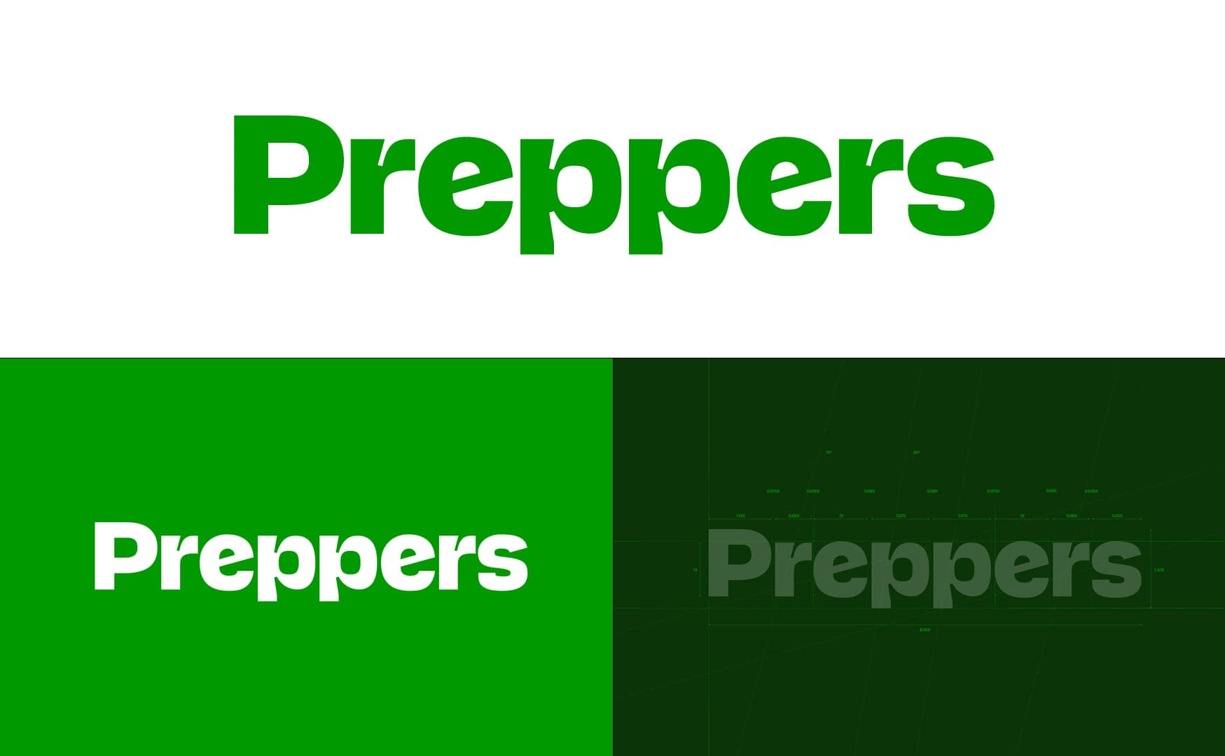
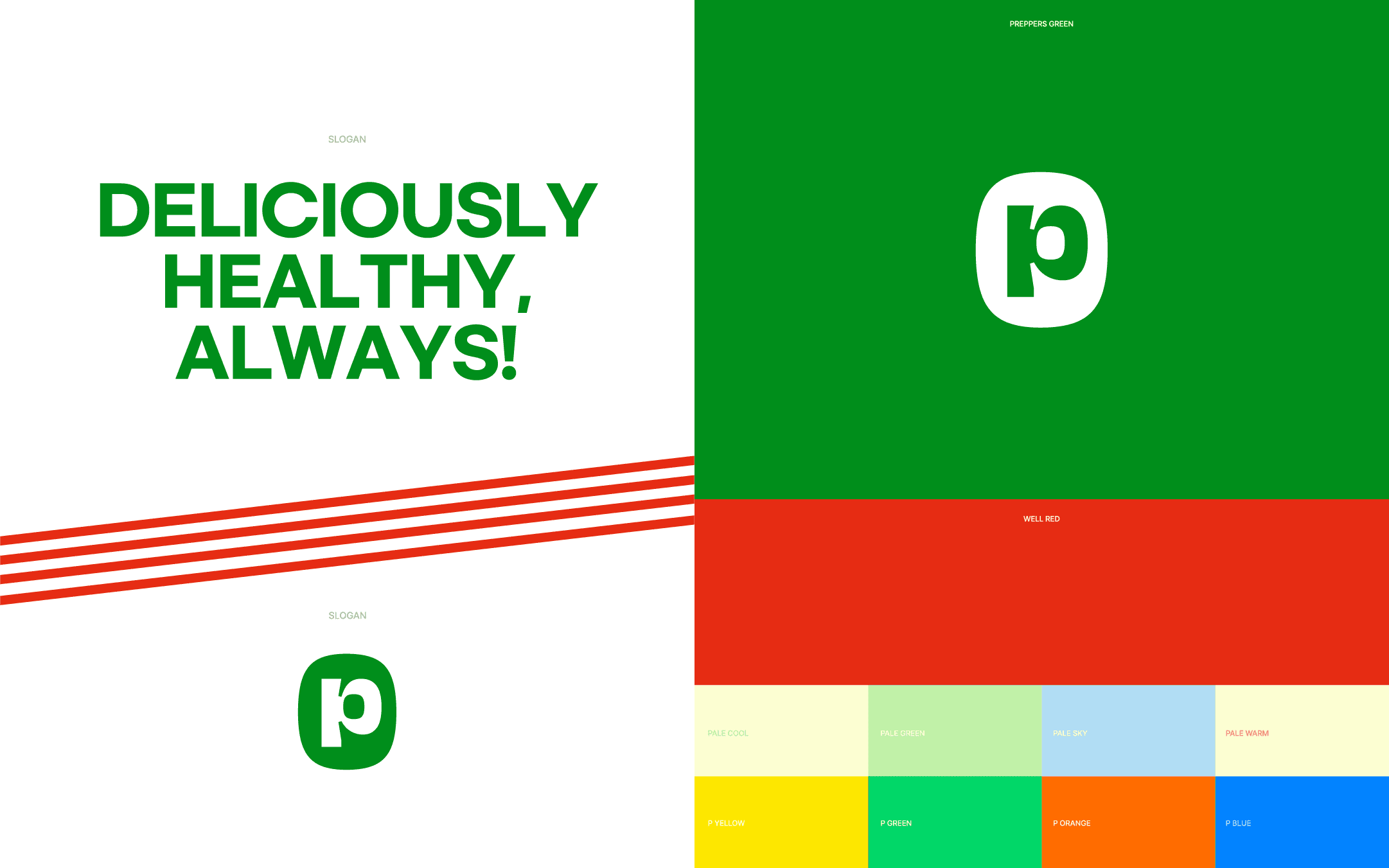
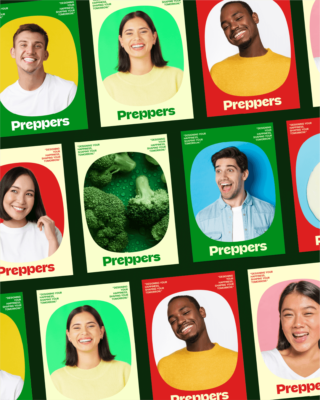
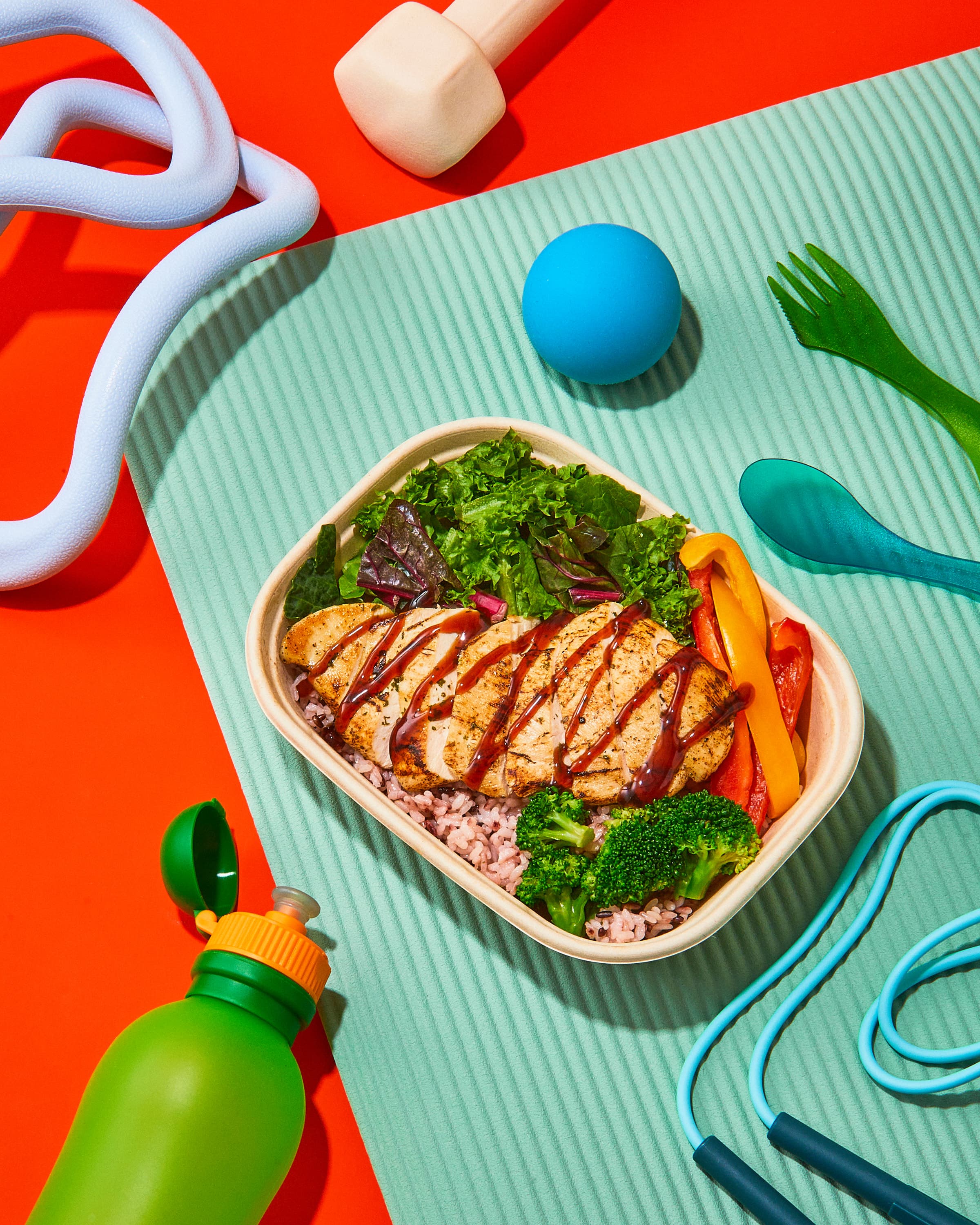
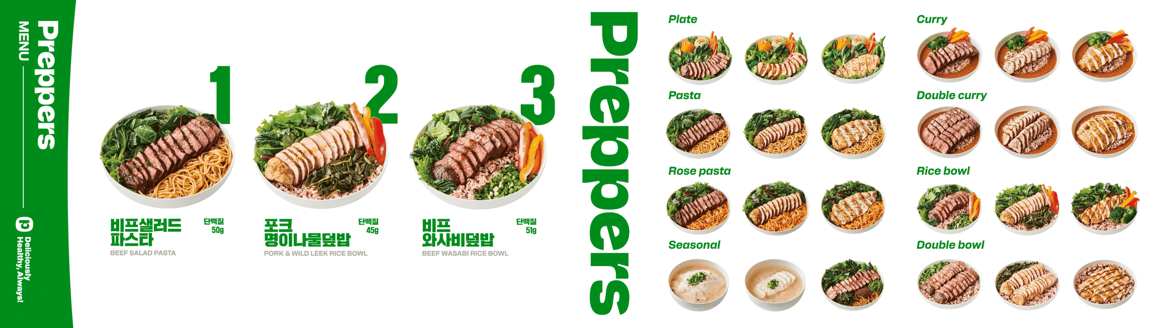
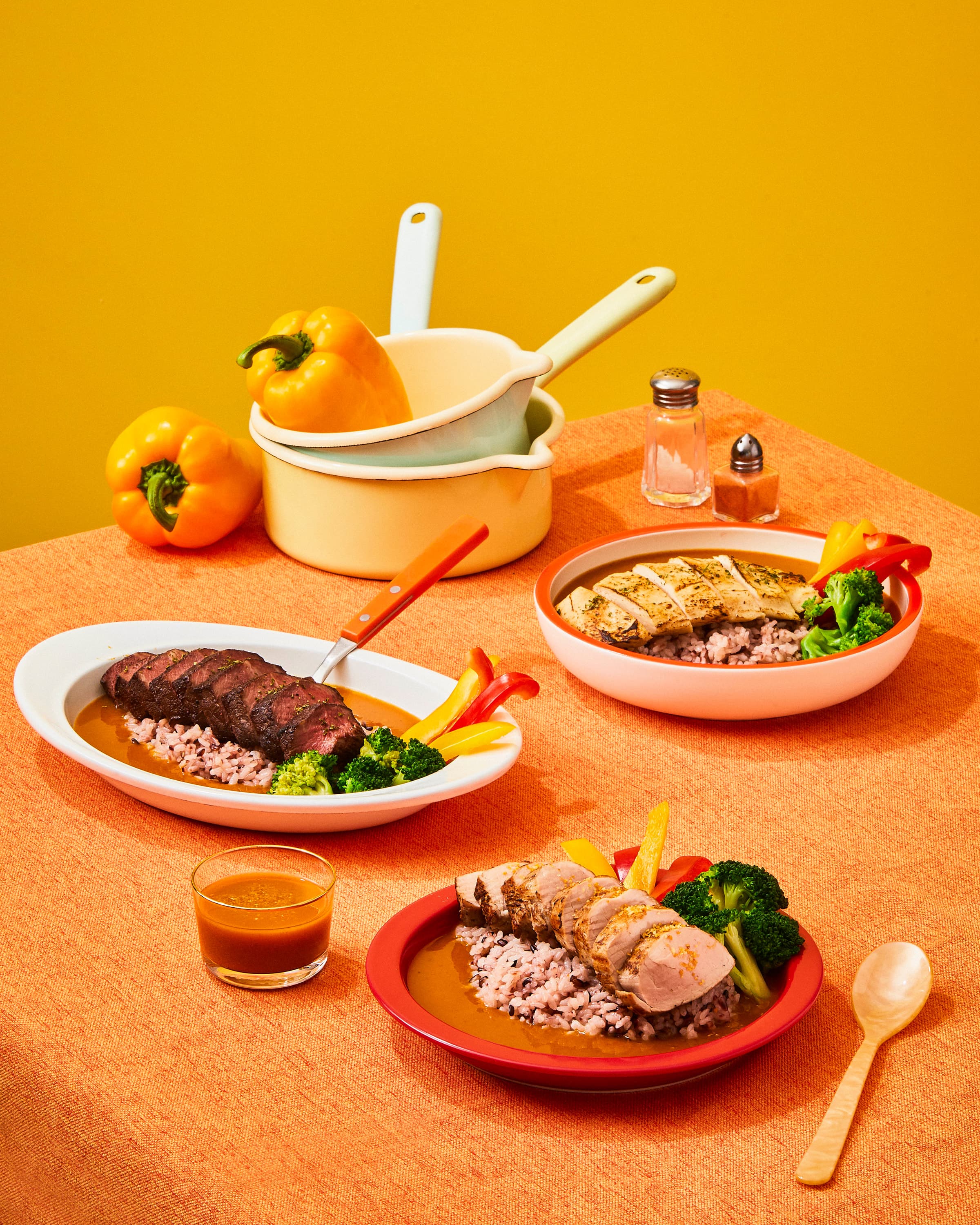
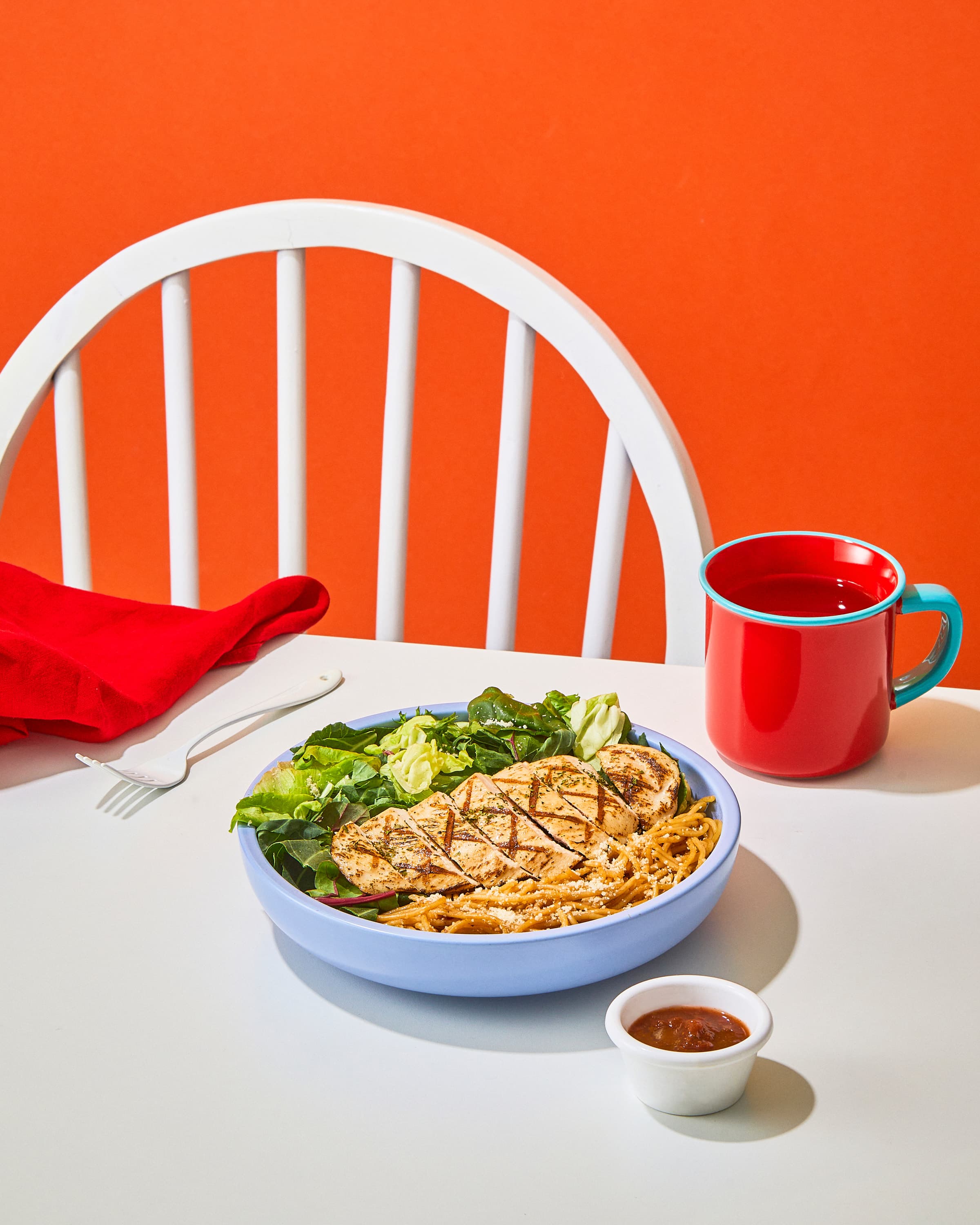
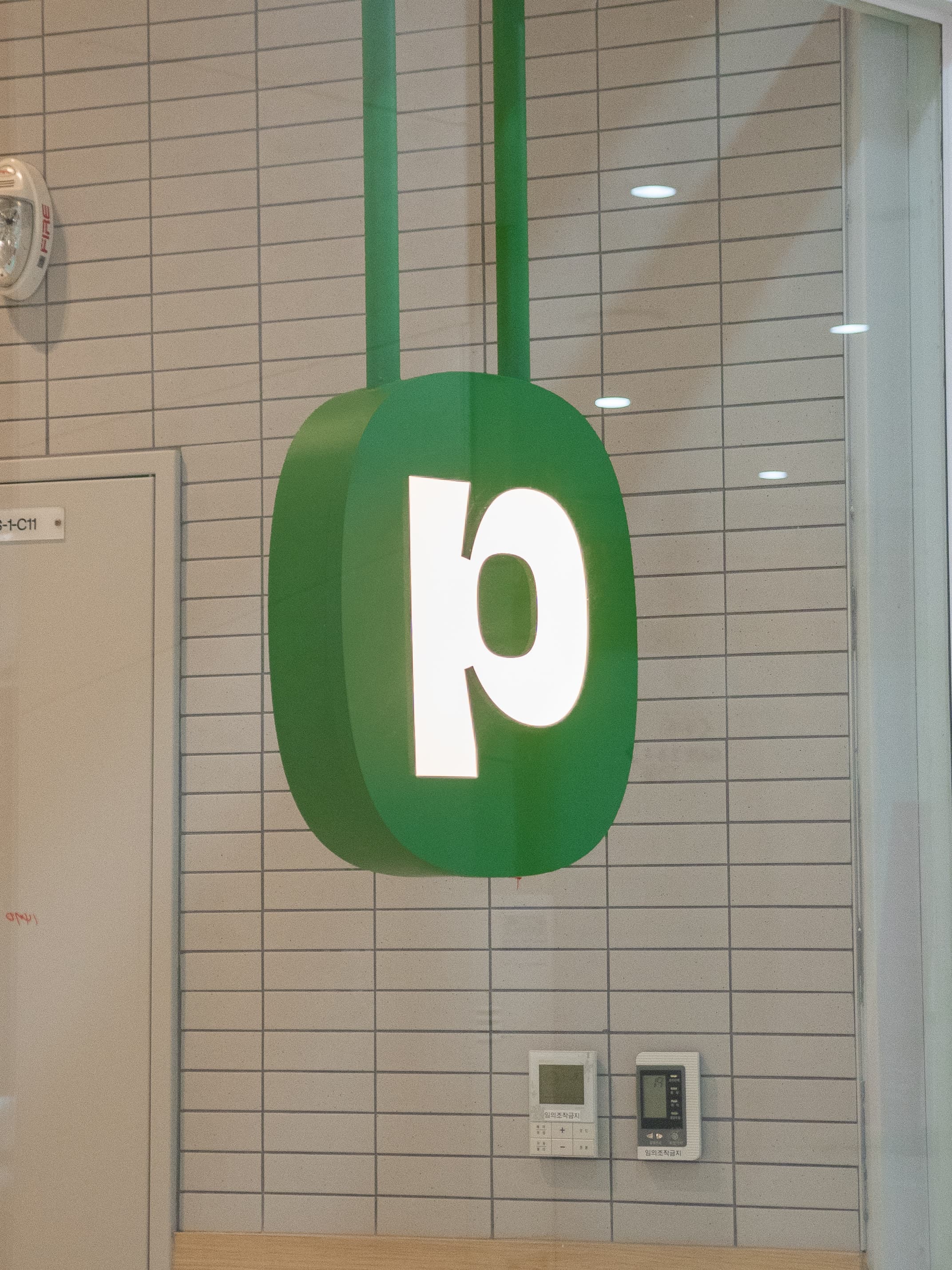
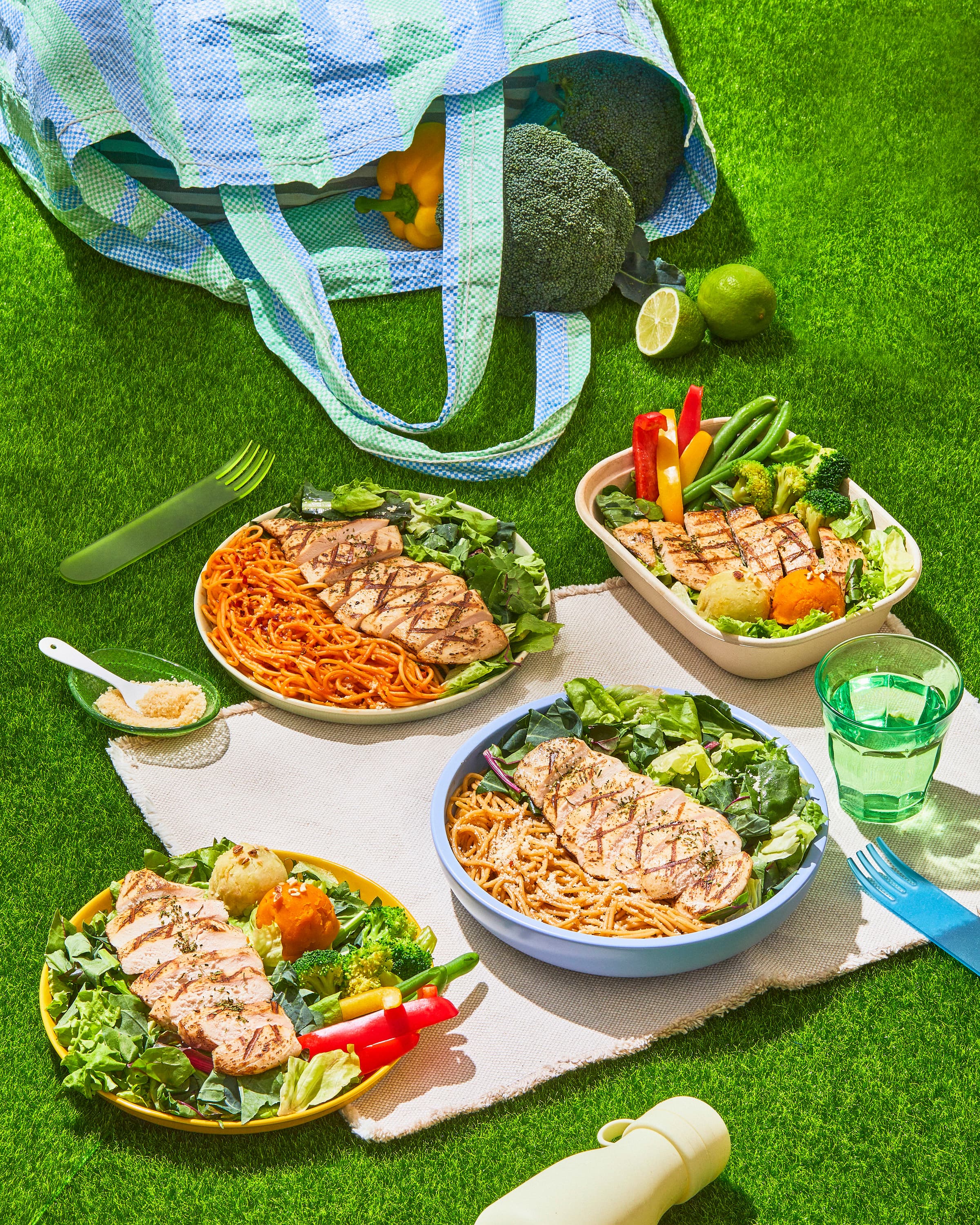
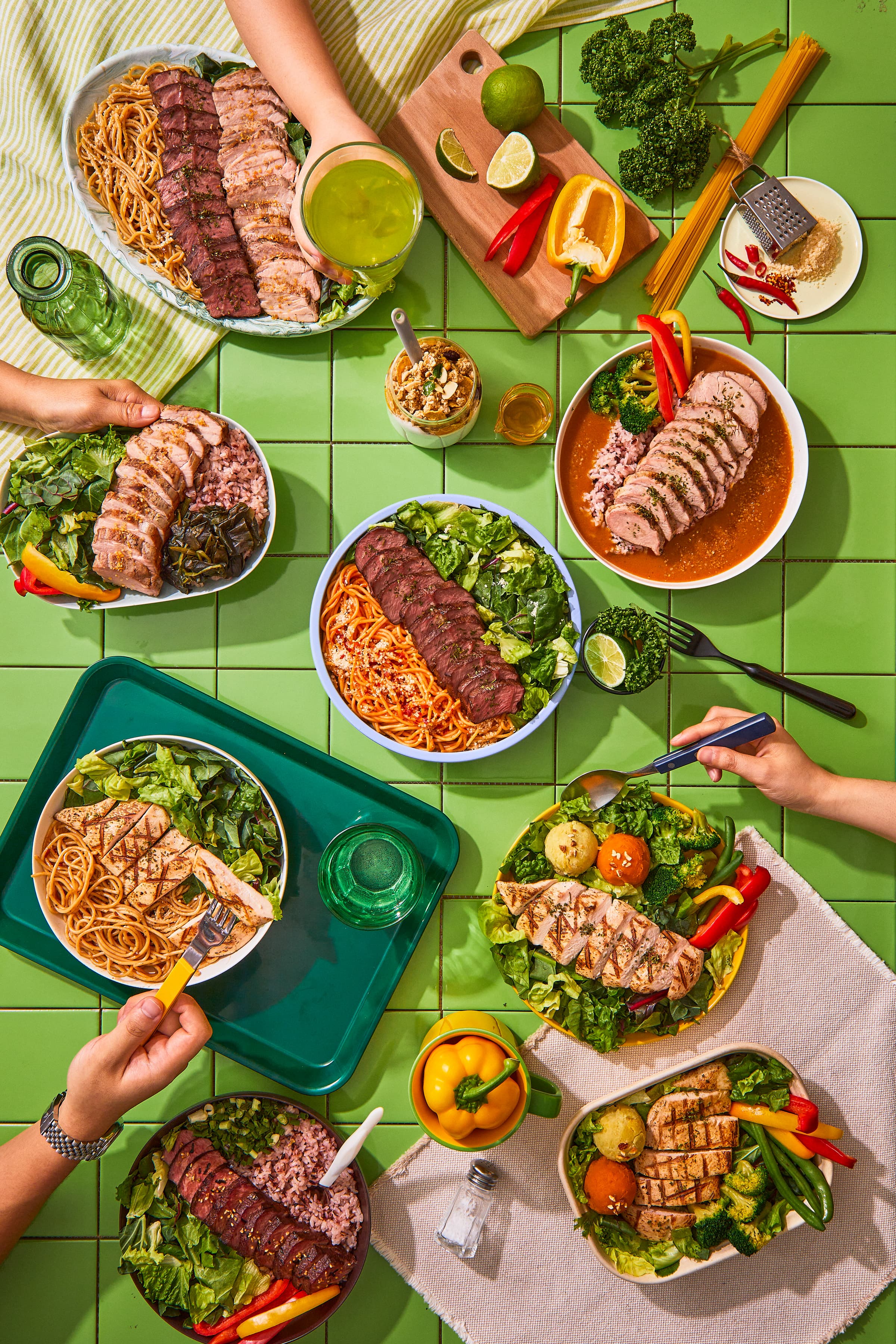
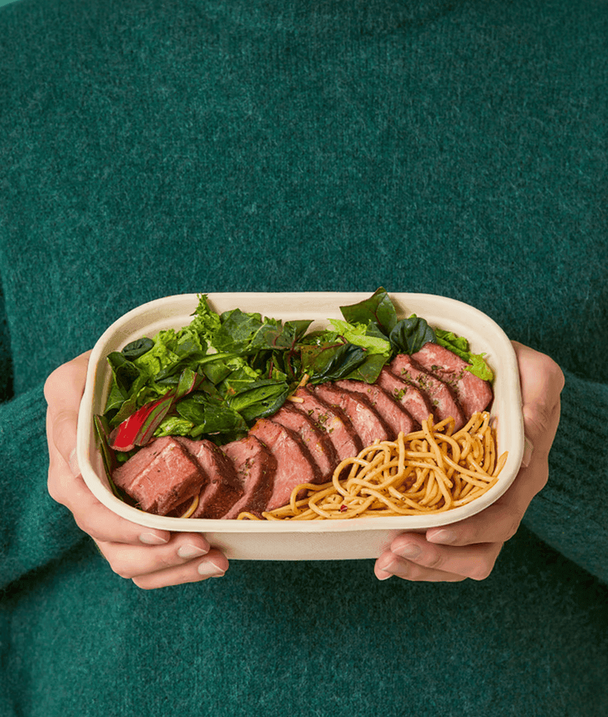
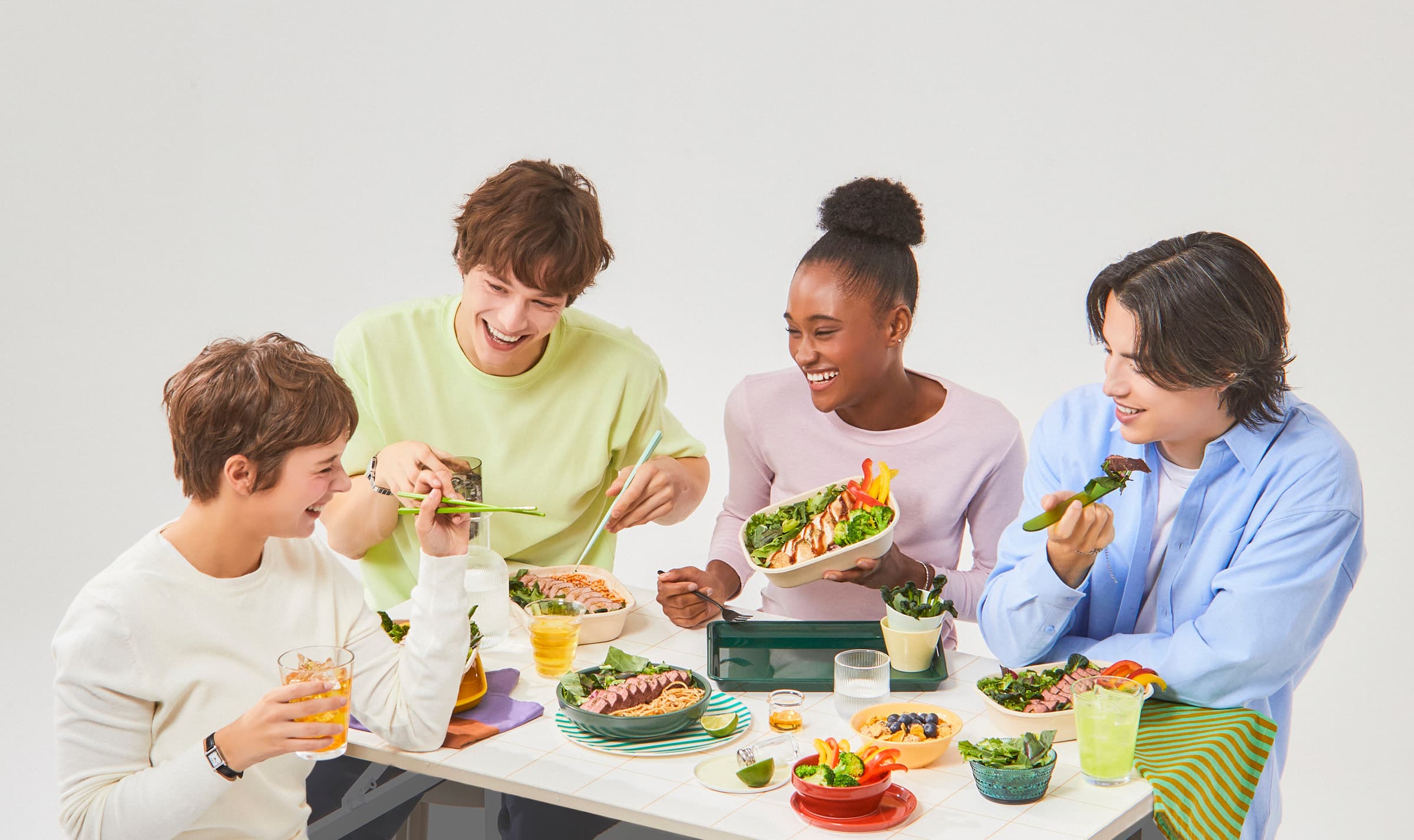
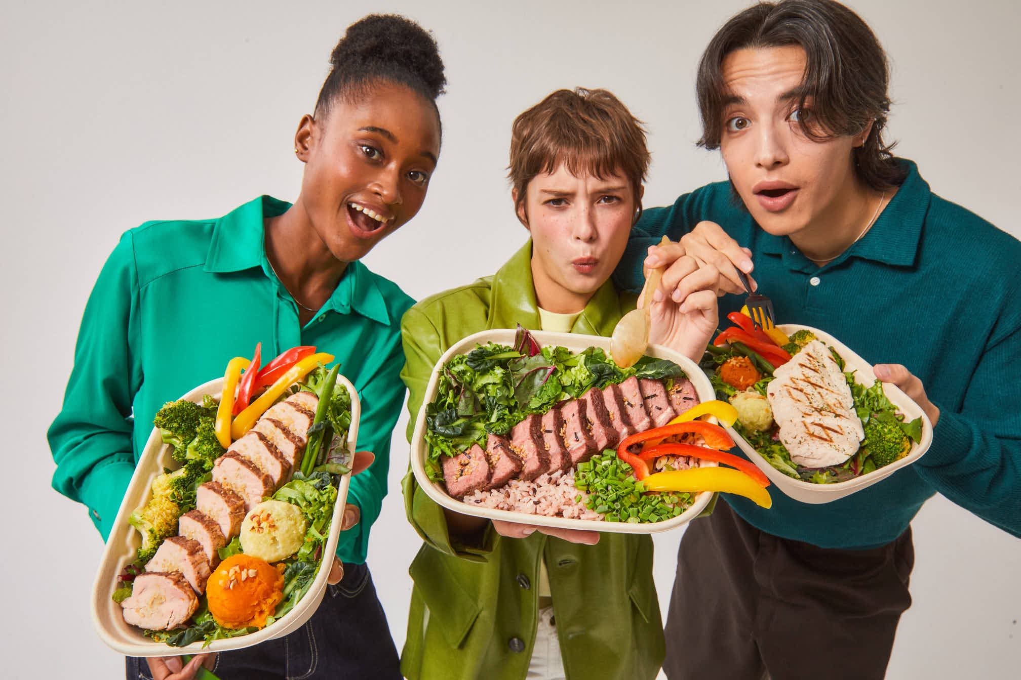
“Making healthy eating feel contemporary and everyday.”Built around a distinctive green palette, the new identity translates PREPPERS’ healthy and fresh positioning into a more contemporary visual language. A clearer, more versatile logo and structured graphic system extend across packaging, signage, and interiors, creating a consistent experience throughout the brand. “건강한 식사를 더 트렌디하고 일상적으로.”그린 컬러를 중심으로 프레퍼스의 건강하고 신선한 이미지를 현대적으로 재해석했습니다. 보다 명료하고 활용도 높은 로고와 정돈된 그래픽 시스템을 구축하고, 이를 패키지와 사인, 매장 인테리어까지 확장해 브랜드의 모든 접점에서 동일한 무드를 경험할 수 있도록 설계했습니다.