MOOVA Drink
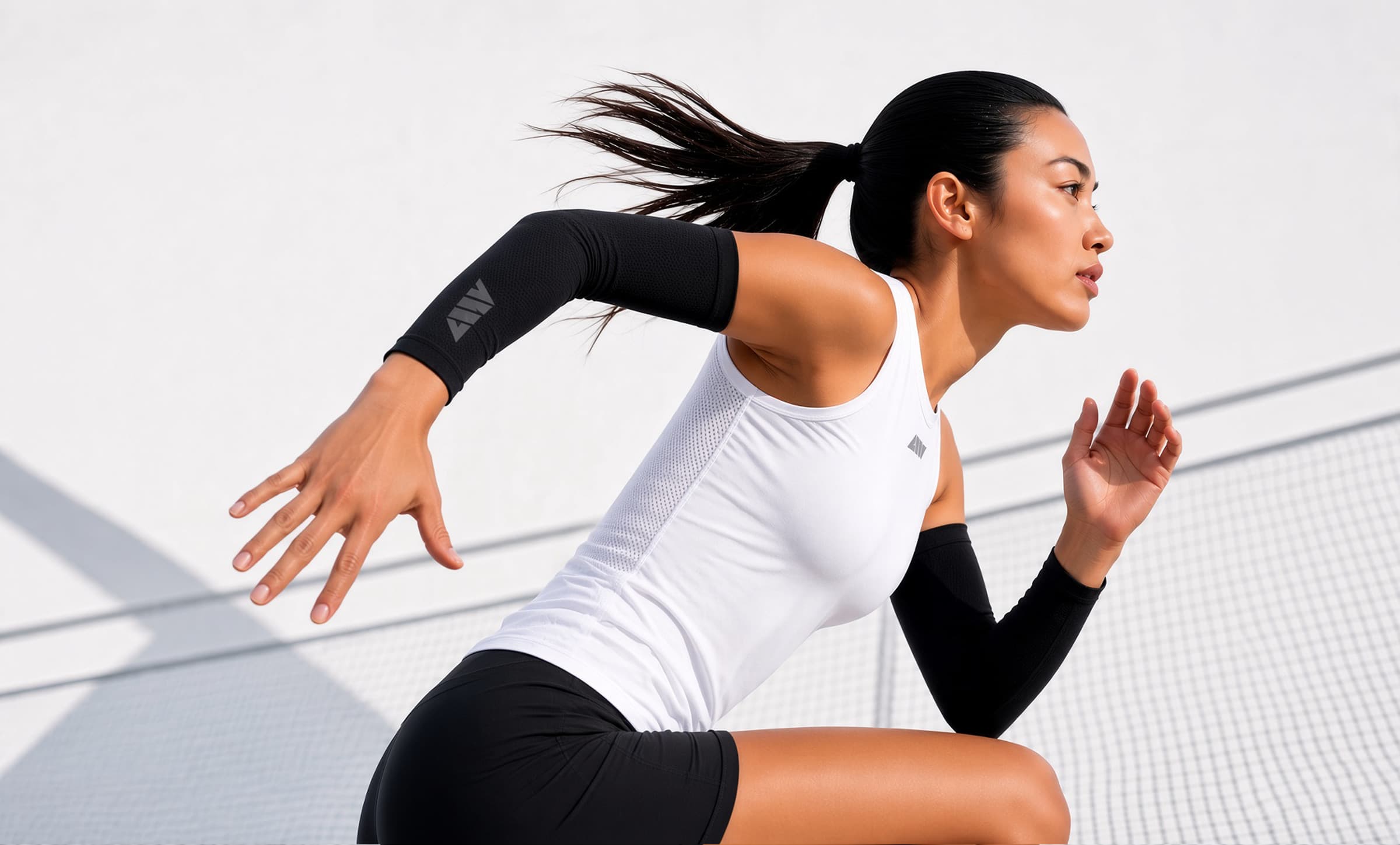
Supplies, a company that has successfully operated various fitness and F&B brands, launched 'GBX,' a new integrated brand inheriting the DNA of its core gym brand, Gymboxx. As part of this brand expansion strategy, we developed a new proprietary protein drink brand to connect with consumers beyond the fitness space and in their everyday lives. 피트니스와 F&B 브랜드를 성공적으로 운영해 온 서플라이스(Supplies)는 자사의 핵심 헬스장 브랜드인 '짐박스(Gymboxx)'의 DNA를 계승하는 새로운 통합 브랜드 'GBX'를 론칭했습니다. 이러한 브랜드 확장 전략의 일환으로, 피트니스 공간을 넘어 일상 속에서도 소비자와 만날 수 있는 자체 프로틴 음료 브랜드를 새롭게 개발하게 되었습니다.
- Role & Scope
- Branding / Naming / Packaging Design & Advertisement
- Category
- Packaging Design
- Year
- 2026
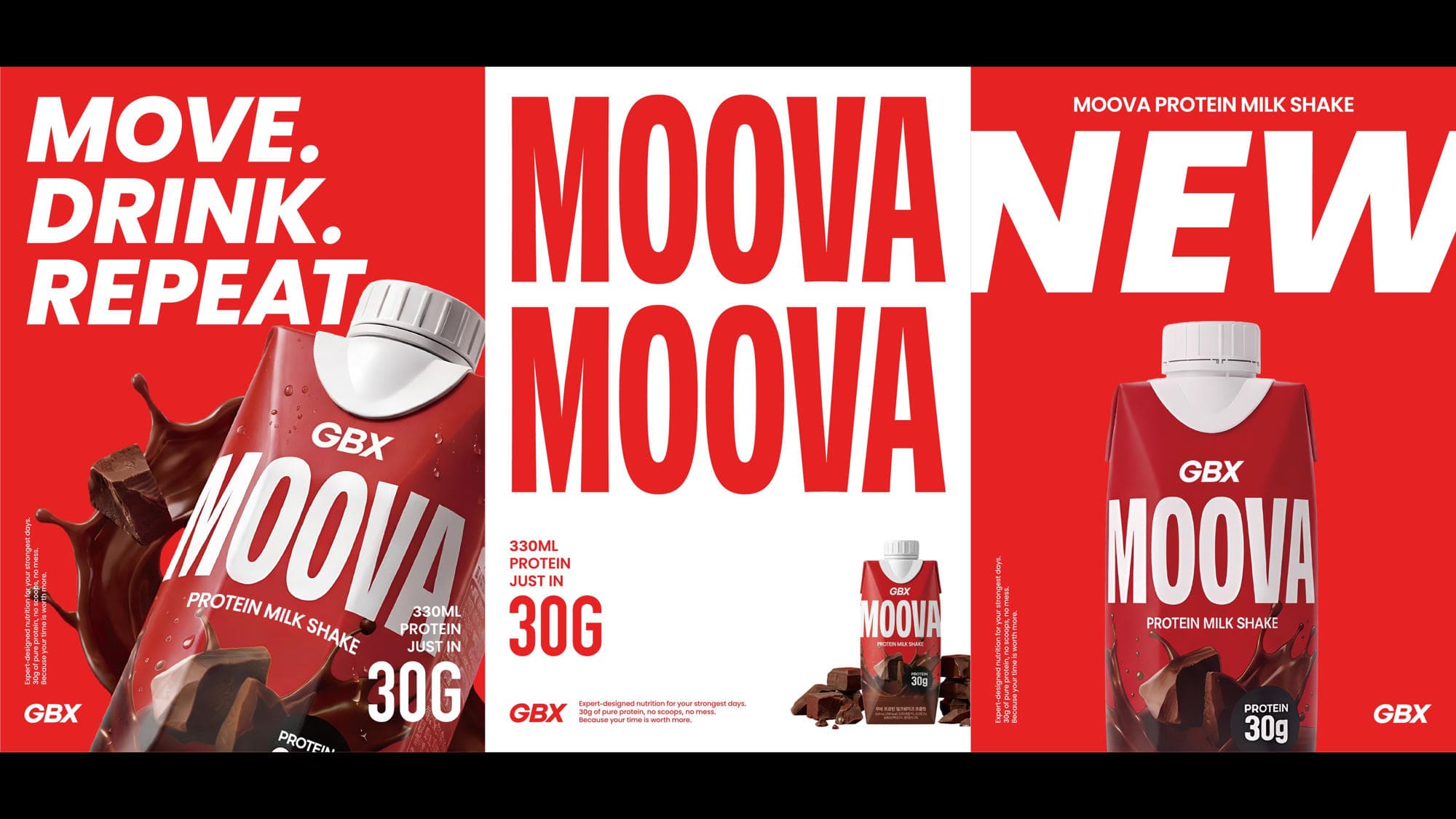
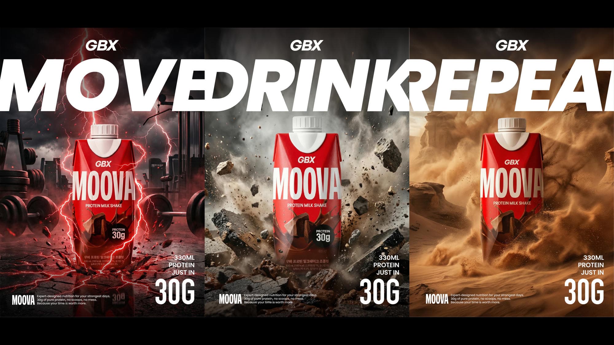
The new protein drink primarily needed to satisfy the needs of our target audience (gym members) within Gymboxx locations, while simultaneously securing mass appeal for future expansion into nationwide convenience store networks.Our challenge was to establish a comprehensive creative direction—spanning brand naming, packaging design, and initial launch advertising—so the product could stand out as a competitive, independent F&B item while maintaining Gymbox's unique identity. 새로운 프로틴 음료는 일차적으로 짐박스 지점 내 타깃 고객(헬스장 이용객)의 니즈를 충족시켜야 했으며, 더 나아가 추후 전국 편의점 유통망 진출을 위해 대중성까지 동시에 확보해야 했습니다. 우리의 과제는 짐박스 고유의 정체성을 유지하면서도 독립적인 F&B 제품으로서의 경쟁력을 갖출 수 있도록, 브랜드 네이밍부터 패키지 디자인, 초기 론칭 광고 기획까지 아우르는 종합적인 크리에이티브 방향성을 수립하는 것이었습니다.
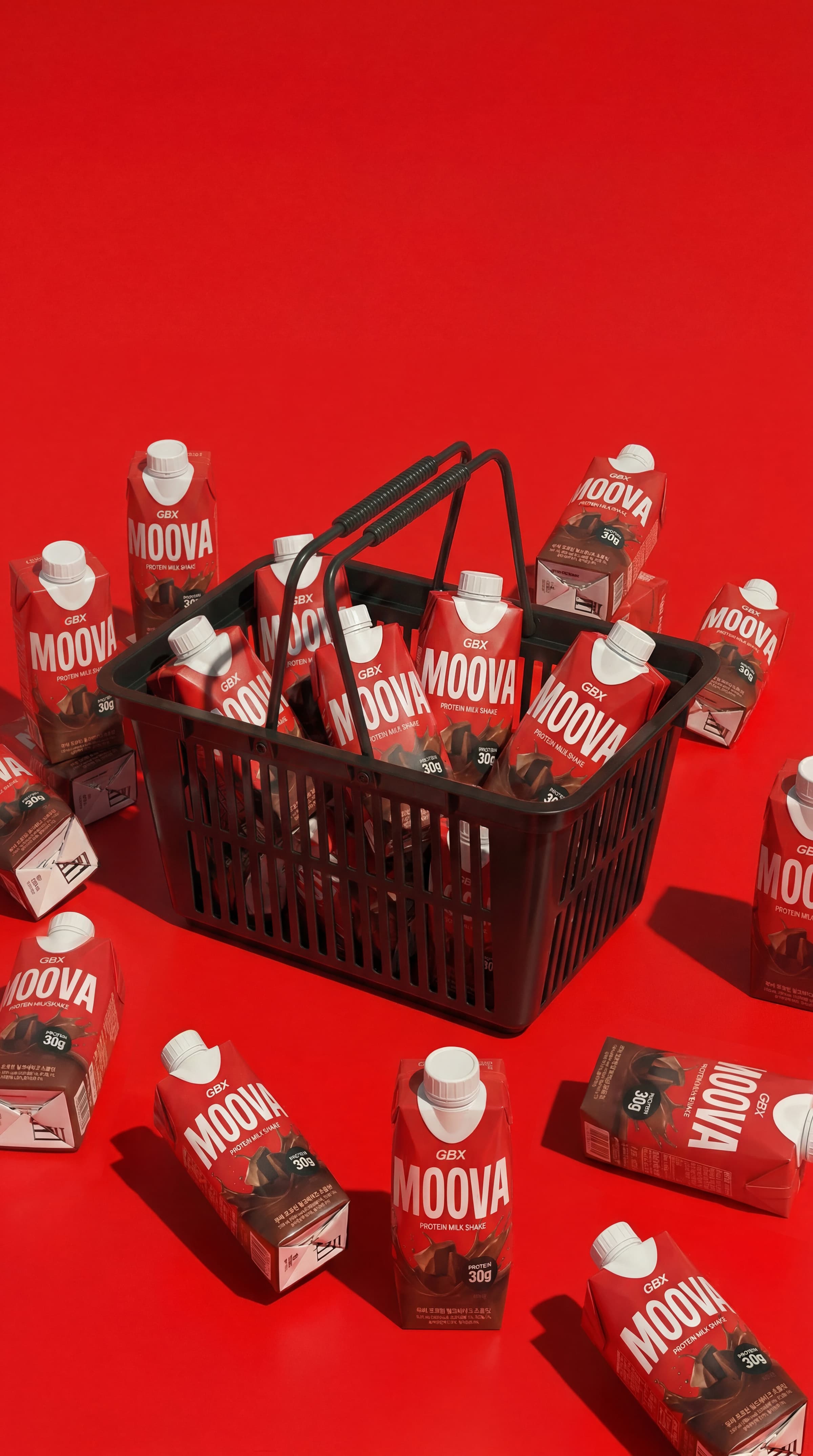
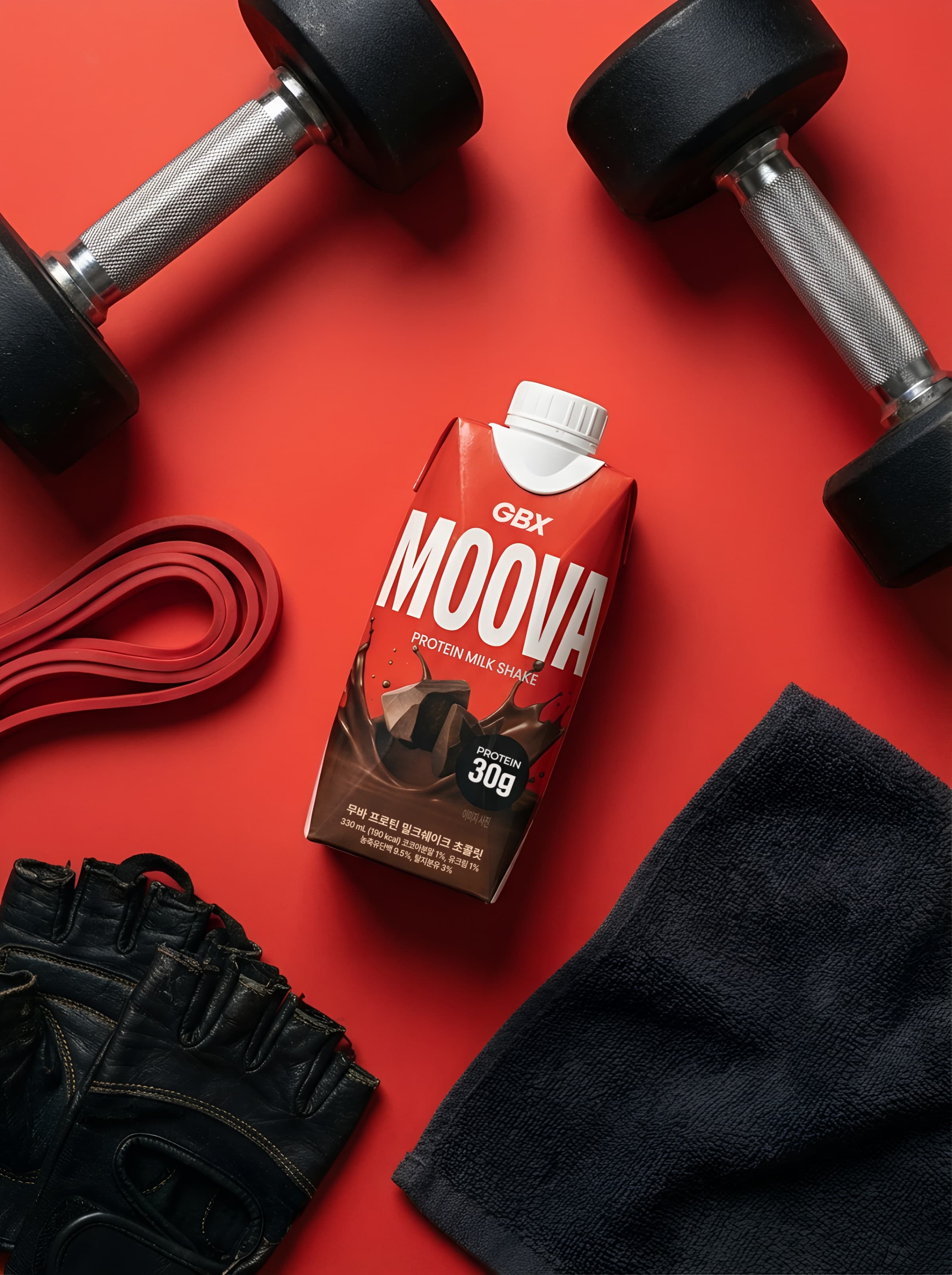
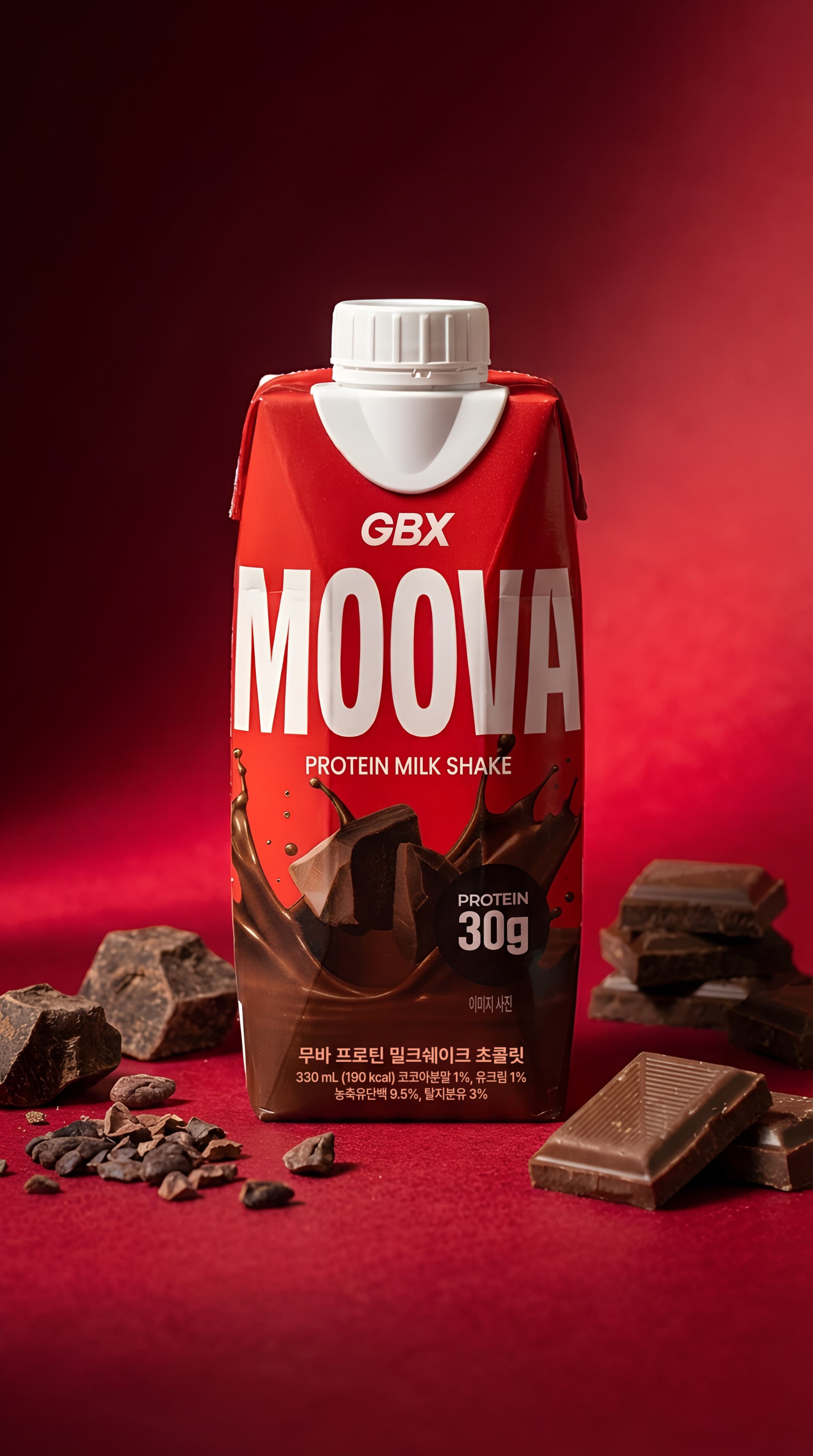
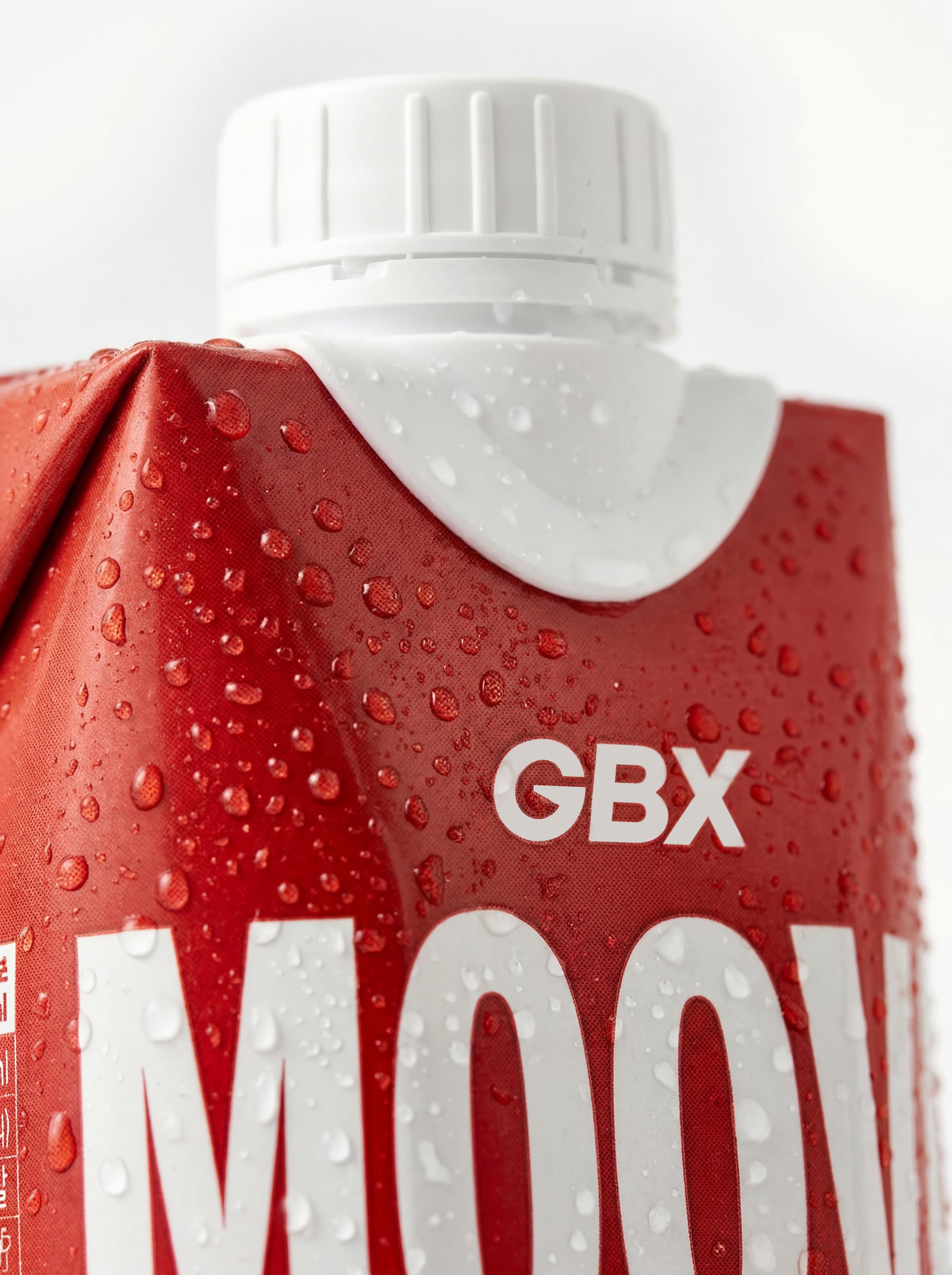
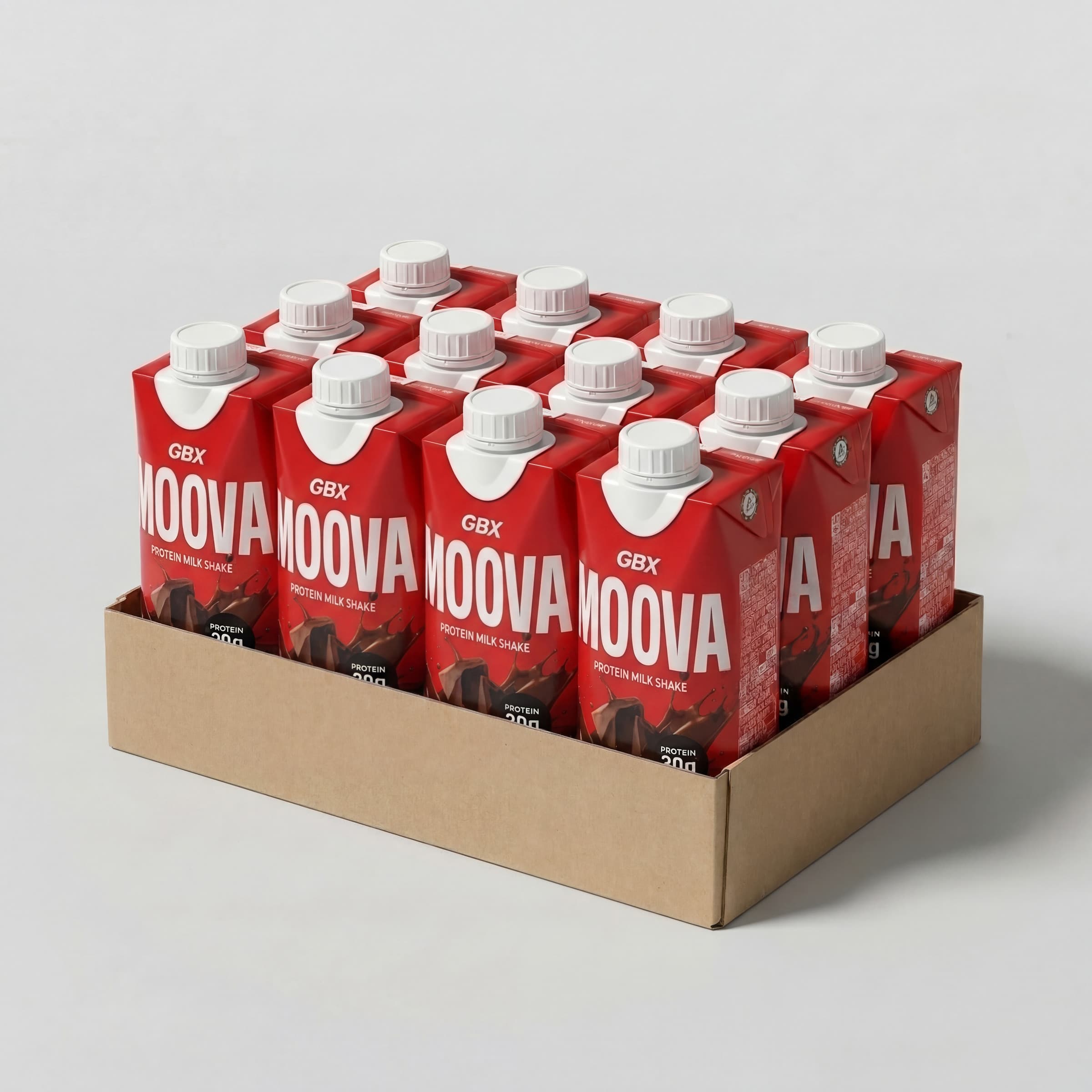
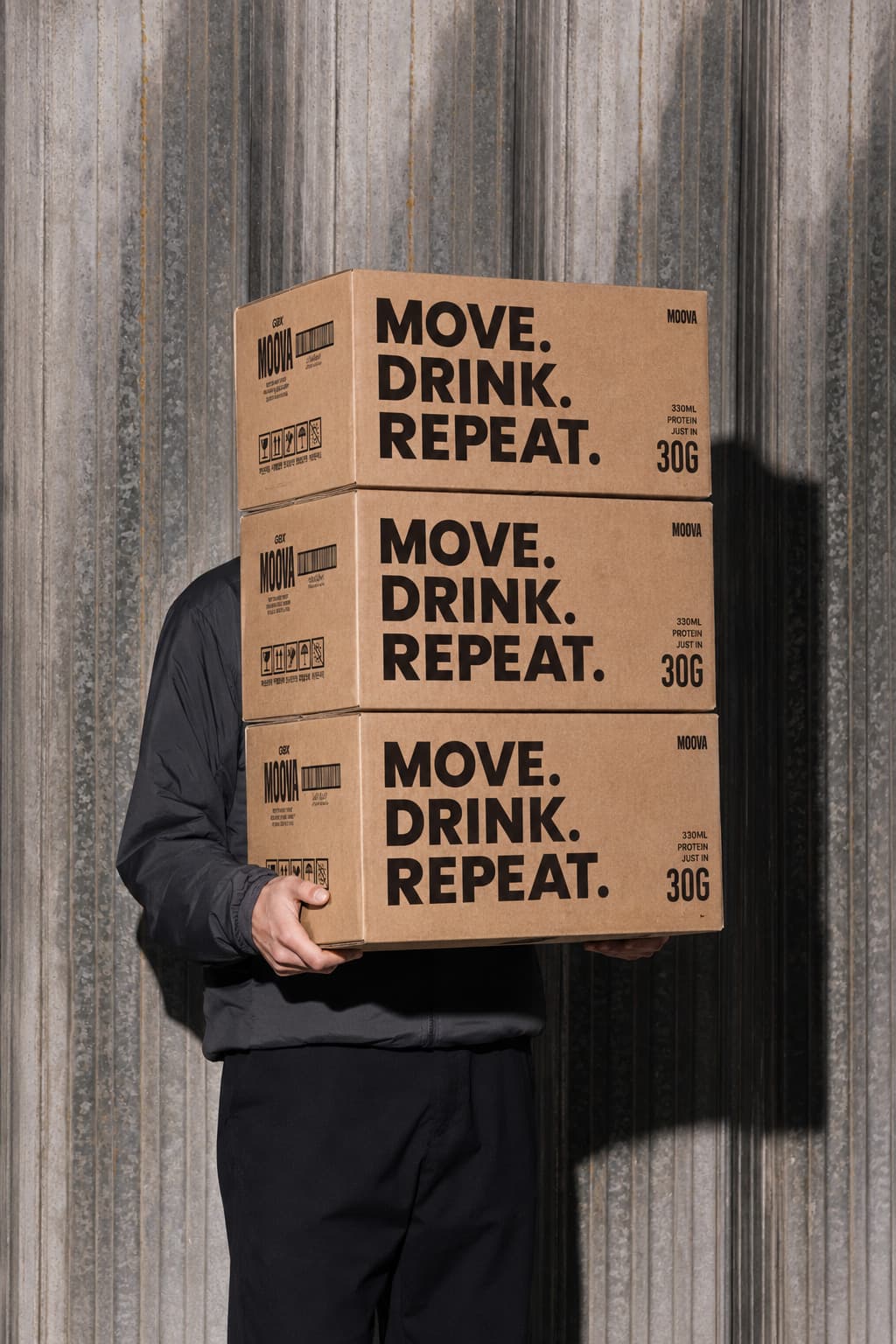
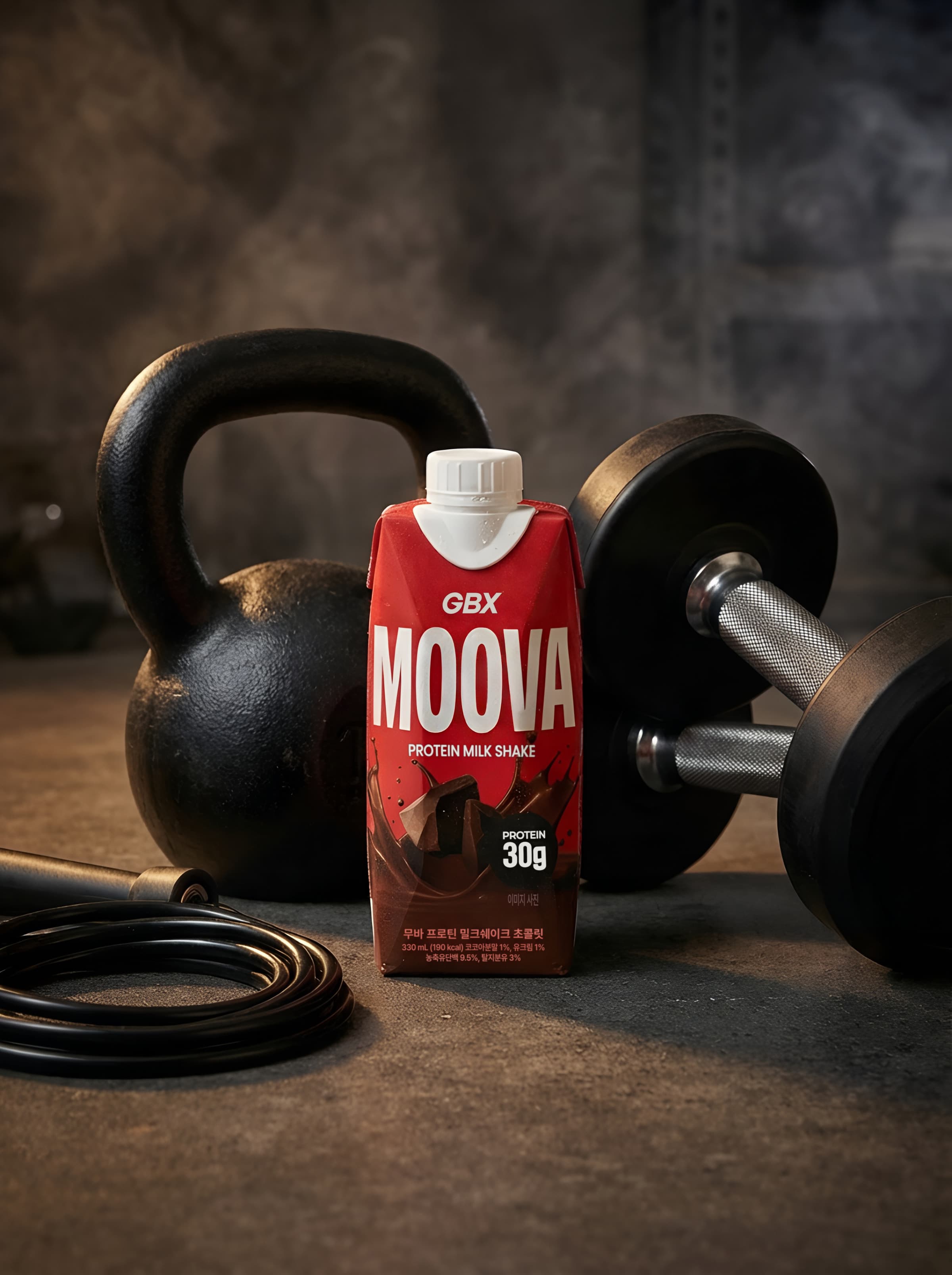
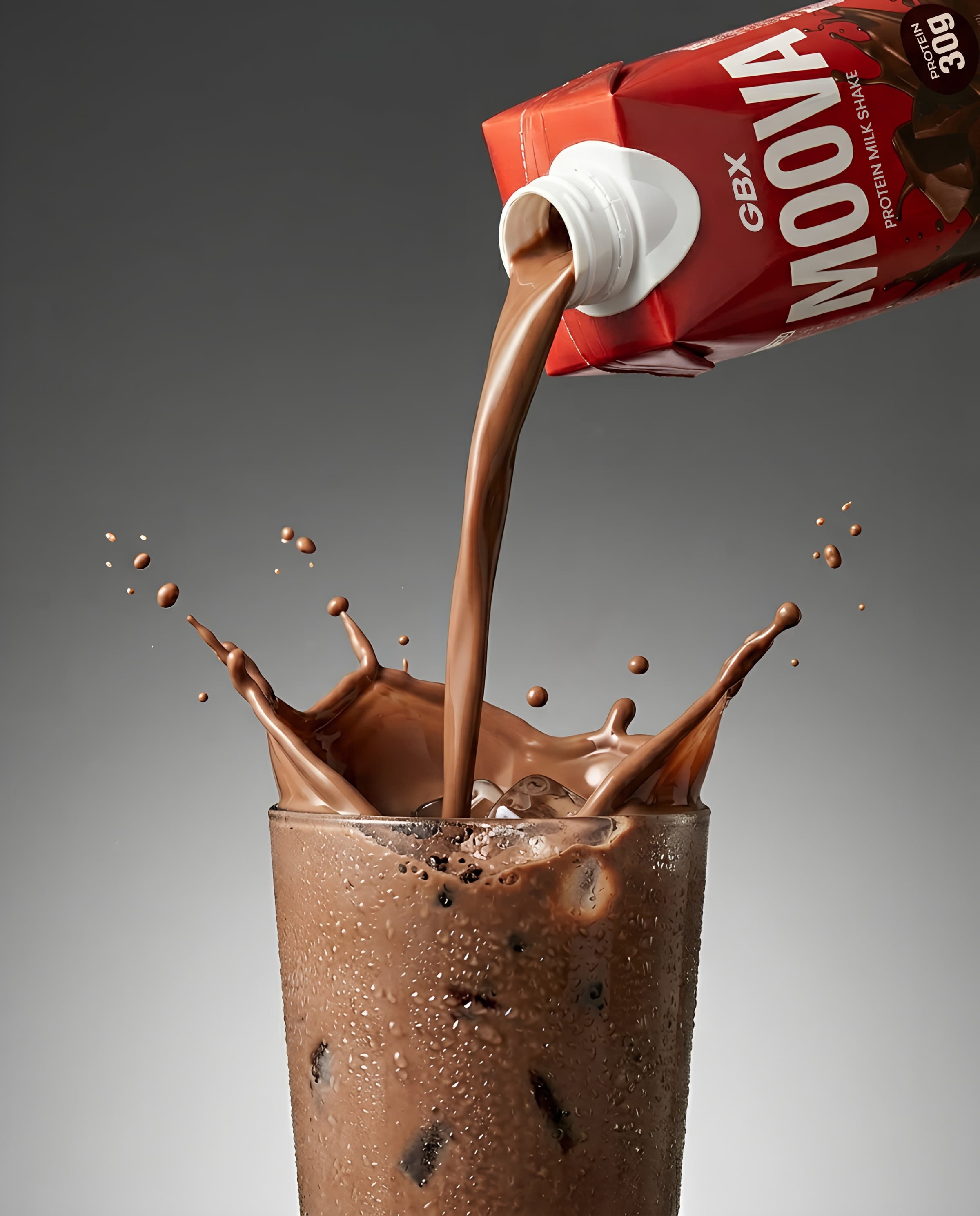
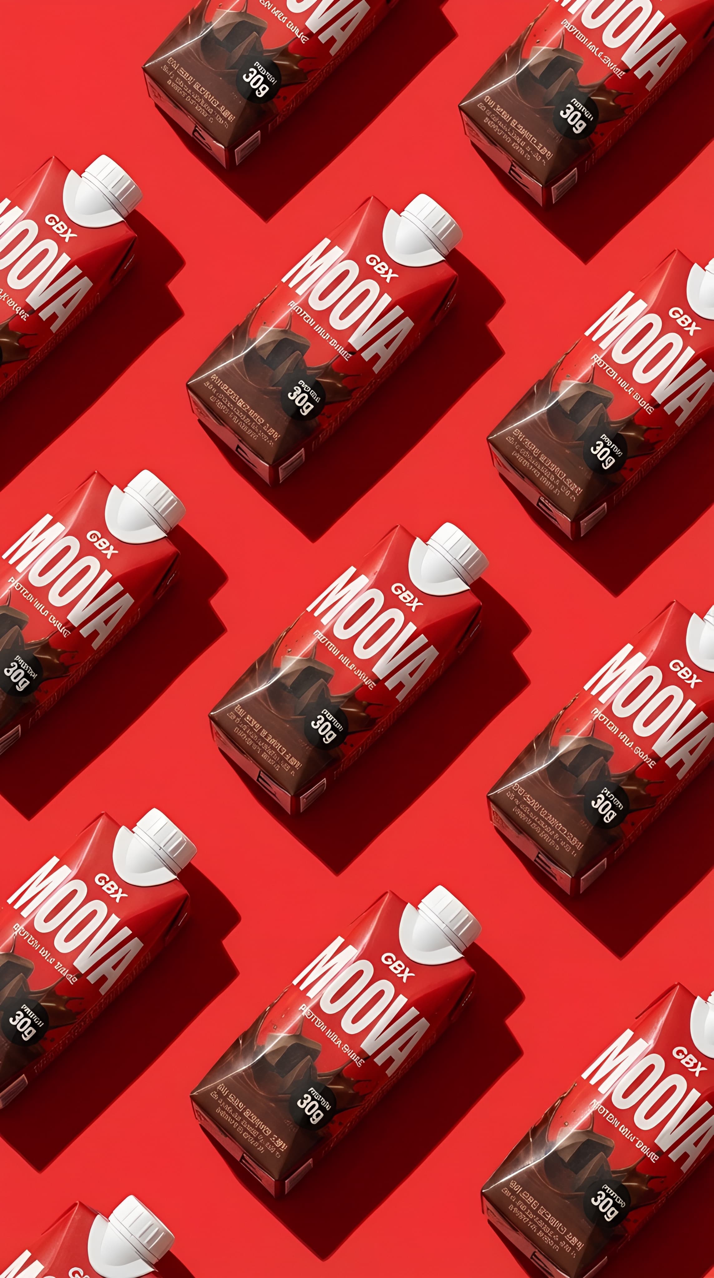
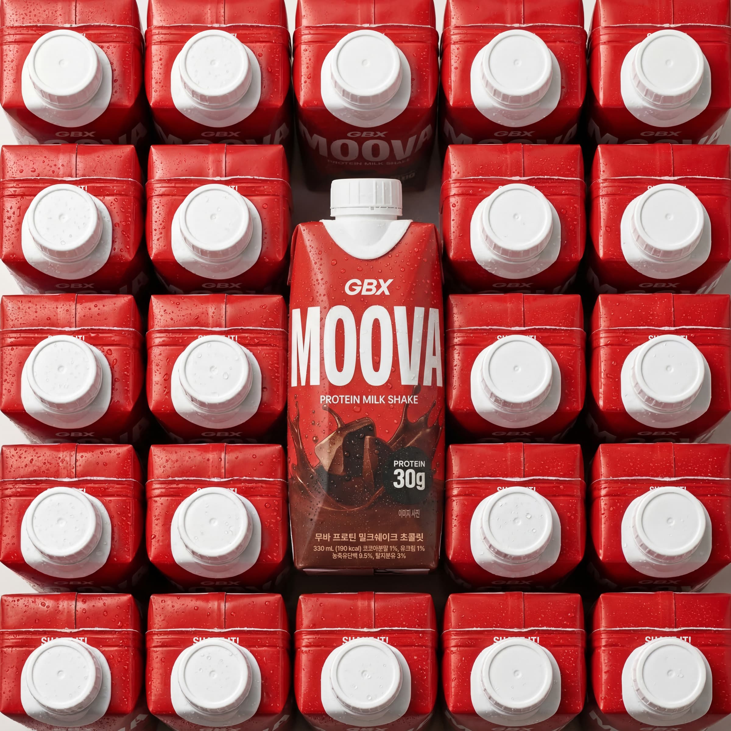
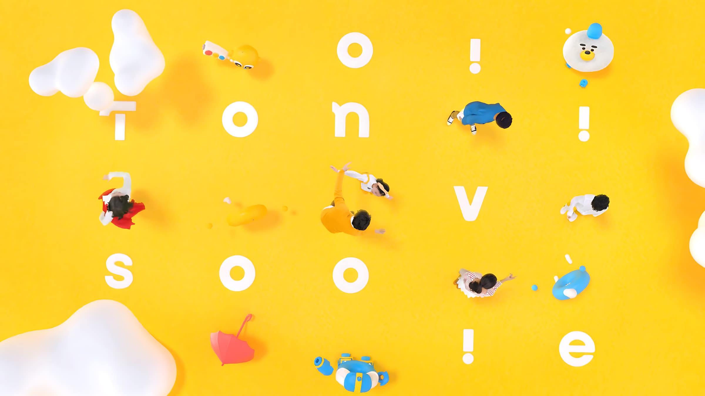
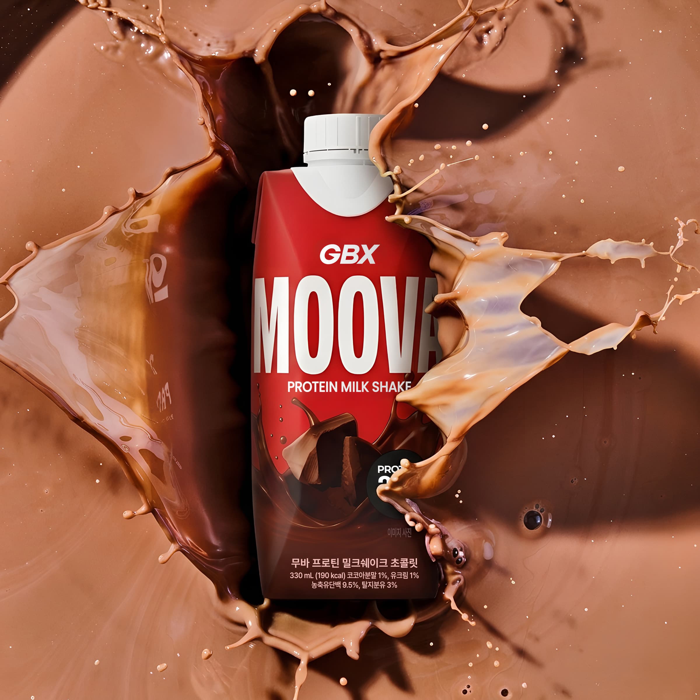
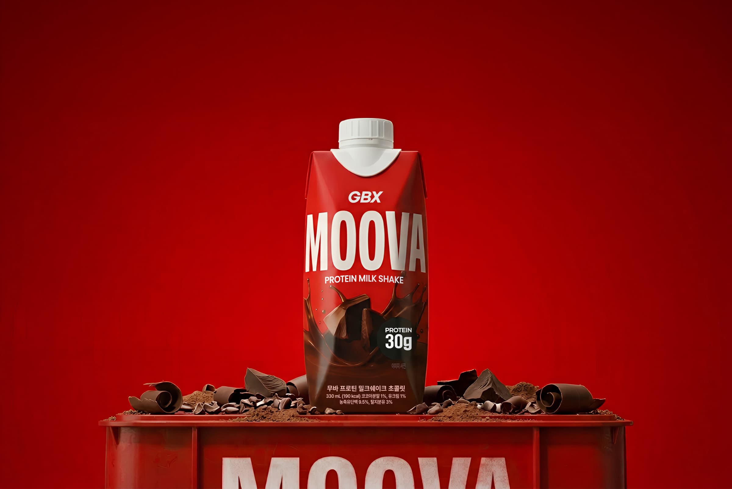
To approach consumers in a friendly manner while intuitively conveying the product's essence, we developed the name 'MOOVA'.This playfully combines a phonetic nod to milk with the dual meaning of the Busan dialect word 'Moova' (meaning "try it"). We then combined it with the parent brand to complete the final name, 'GBX MOOVA'. Visually, to capture Gymboxx's signature energetic and dynamic DNA, we adopted an intense red as the main color and featured bold typography front and center to express the brand's confidence, delivering a powerful impact.Furthermore, to help consumers make intuitive choices, we placed vivid imagery representing each flavor at the bottom of the packaging.Through this, we completed a packaging design that conveys the authenticity of a product made by a professional fitness company, ensuring it achieves overwhelming visual dominance against competitors on retail shelves, such as in convenience stores. 소비자에게 친근하게 다가가면서도 제품의 본질을 직관적으로 전달하기 위해 '무바(MOOVA)'라는 네이밍을 개발했습니다.이는 우유를 연상시키는 어원과 "한번 먹어보라"는 의미를 담은 부산 방언 '무바'의 중의적인 의미를 유쾌하게 결합한 결과물이며, 상위 브랜드인 GBX와 결합해 'GBX MOOVA'라는 최종 브랜드명을 완성했습니다.시각적으로는 짐박스 특유의 에너제틱하고 역동적인 DNA를 담아내기 위해 강렬한 레드 컬러를 메인으로 채택하고, 브랜드의 자신감을 드러내는 볼드한 타이포그래피를 전면에 내세워 강력한 임팩트를 주었습니다.또한, 소비자들의 직관적인 선택을 돕기 위해 패키지 하단에는 각 제품의 맛을 생생하게 나타내는 이미지를 배치했습니다.이를 통해 전문 피트니스 기업이 만든 제품의 진정성을 전달함과 동시에, 향후 편의점 등 리테일 매대 위에서도 타사 제품 대비 압도적인 시각적 우위를 점할 수 있도록 패키지를 완성했습니다.